
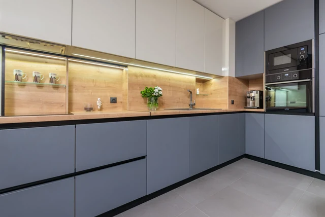

The first time I stood in an anthracite kitchen I genuinely thought the lights were off. Then the owner flicked on a strip under the wall units and the whole room changed — the units went from flat and gloomy to deep, soft and expensive-looking. That is the thing about anthracite kitchen ideas UK homeowners keep pinning: the colour is not the hard part. The light around it is. Get that right and it is the most grown-up shade you can put in a kitchen. Get it wrong and it swallows the room.
| What anthracite actually is | A very deep, rich grey that reads almost black |
|---|---|
| Grey’s share of UK kitchens | 21% — the most-used kitchen colour, ahead of white (19%) |
| Best room aspect | South-facing, or any kitchen with generous daylight |
| Safest way to use it | Two-tone: anthracite on base units, something paler above |
| Worktops that suit it | Marble, quartz, or warm timber |
| Hardware that lifts it | Brass, bronze, brushed steel — anything bright |
| Non-negotiable | Under-cabinet lighting |
What Anthracite Actually Is (And Why It Is Not Just Grey)
What Anthracite Actually Is (And Why It Is Not Just Grey)
Image source: pexels.com
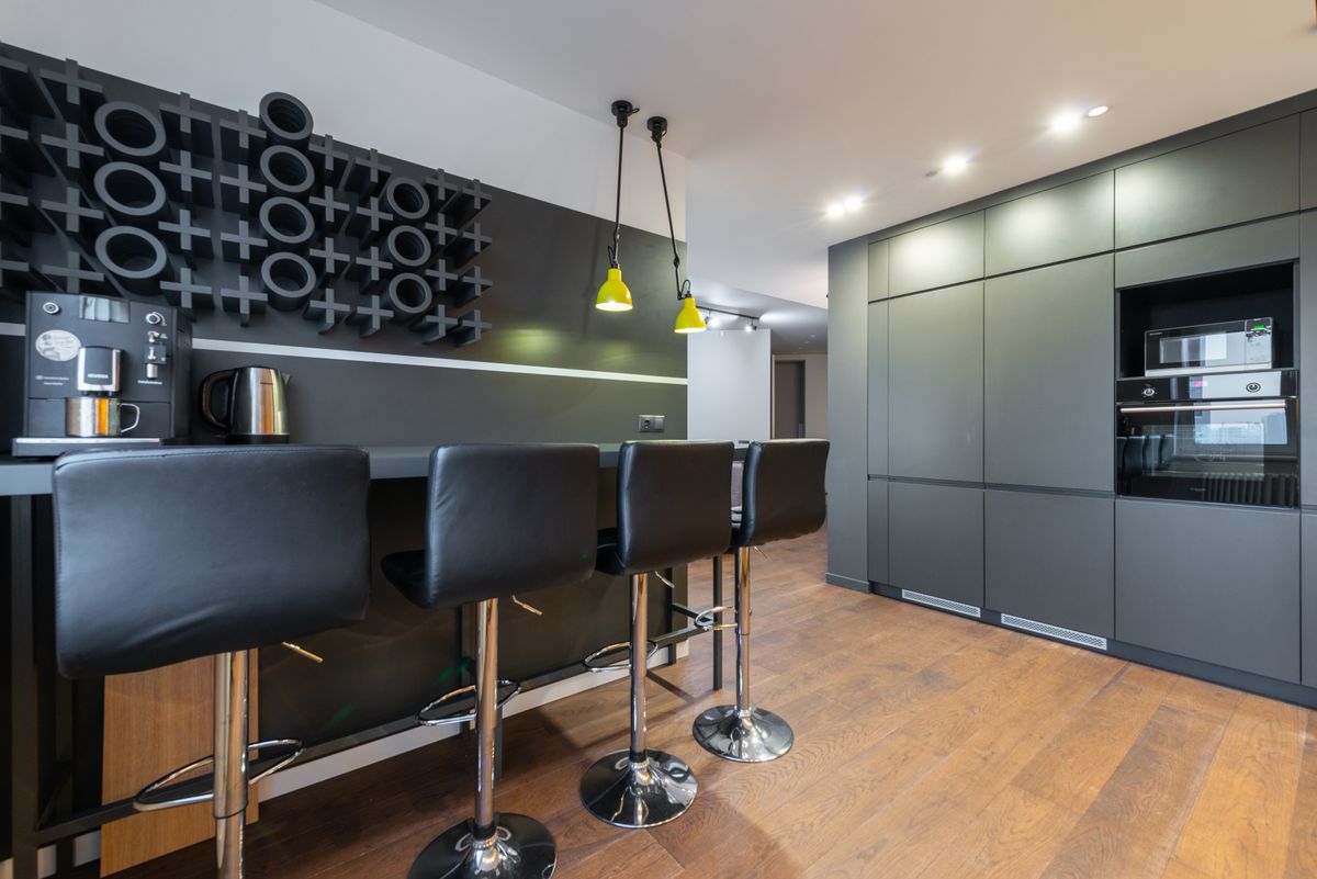
Ask ten people what anthracite is and you will get ten answers, which is half the reason people order the wrong doors. Anthracite is named after the coal — a very deep, rich grey that reads almost black in low light and softens to a warm charcoal when the sun hits it. It is darker than charcoal, cooler than graphite, and a world away from the pale greys most UK kitchens were fitted with a decade ago. That matters, because grey is still the most-used kitchen colour in Britain at 21%, ahead of white on 19% — but most of that 21% is the light end. If you have only ever seen dove grey kitchen cabinets in a showroom, anthracite will still surprise you in person. Order a sample door and live with it for a week before you commit.
Be Honest About Which Way Your Kitchen Faces
Be Honest About Which Way Your Kitchen Faces
Image source: pexels.com
This is the one that decides everything, and nobody in a showroom will ask you. Dark colours need daylight to look rich rather than heavy, which is why anthracite works best in south-facing kitchens where light pours in for most of the day. A friend of mine fitted anthracite in a north-facing galley and spent the next year describing it as “a bit cave-like”, which is exactly what it was. If your kitchen faces north or east, that does not rule anthracite out, but it does mean you use less of it and light it properly. Stand in the room at three in the afternoon in November — not on a bright Saturday morning — and be honest about what you see.
Two-Tone Is the Safest Way In
Two-Tone Is the Safest Way In
Image source: pexels.com
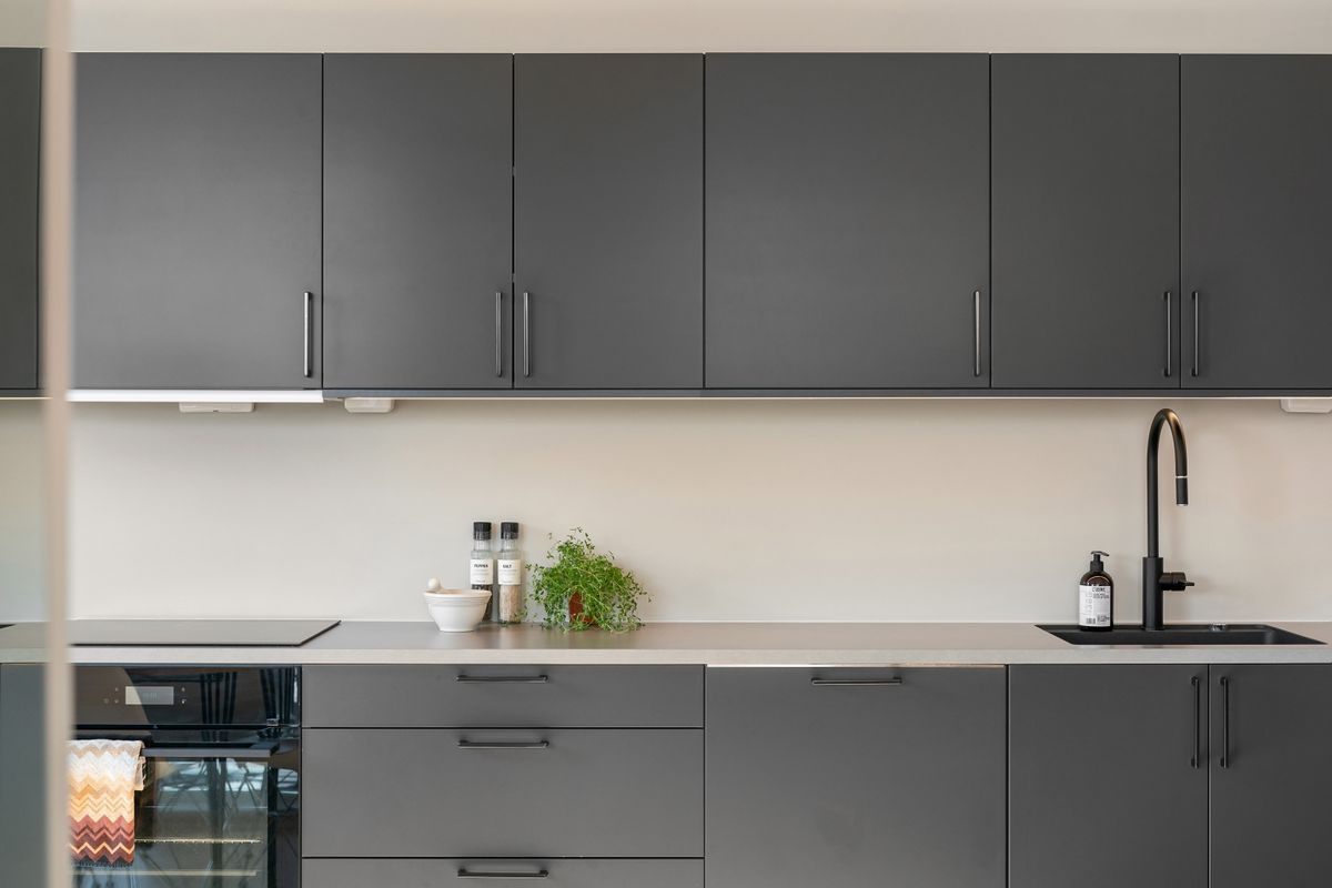
If you want anthracite but you are nervous, this is the answer, and it happens to be the single biggest kitchen trend for 2026. Put the anthracite on the base units and something paler on the wall units. It works for a reason that is almost architectural: the darker shade at floor level lowers the visual centre of gravity, so the room feels taller and calmer. It also hides the scuffs that collect on kick plates and cupboard doors where shoes and mop heads land. Pairing anthracite below with a warm off-white or a soft oat above gives you the drama without the cave. It is the same logic behind a black and grey kitchen, just softer and easier to live with.
Worktops: Where Anthracite Either Sings or Sulks
Worktops: Where Anthracite Either Sings or Sulks
Image source: pexels.com
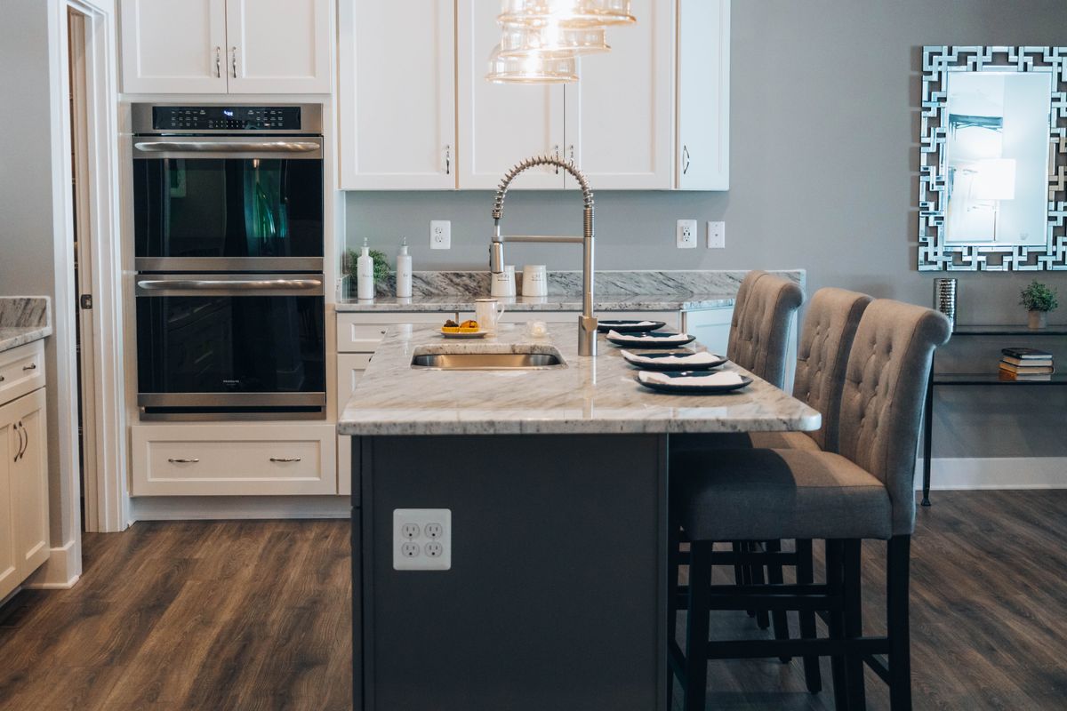
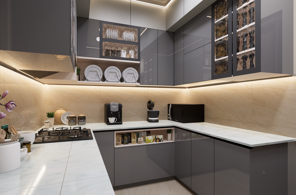
The worktop is doing more work than you think. Against anthracite, a busy speckled surface turns muddy, because there is no contrast for the pattern to read against. What does work is either clean and pale or genuinely warm. Marble and quartz in a white or light grey give you a crisp line above the units and bounce light back into the room, which is exactly what a dark kitchen needs. Timber does the opposite job and does it beautifully — oak or walnut against anthracite is the pairing that stops the scheme feeling cold, and it is why a grey and oak kitchen has stayed popular for so long. Avoid dark worktops on dark units unless the room is enormous and very bright.
Lighting Is Not Optional Here
Lighting Is Not Optional Here
Image source: pexels.com
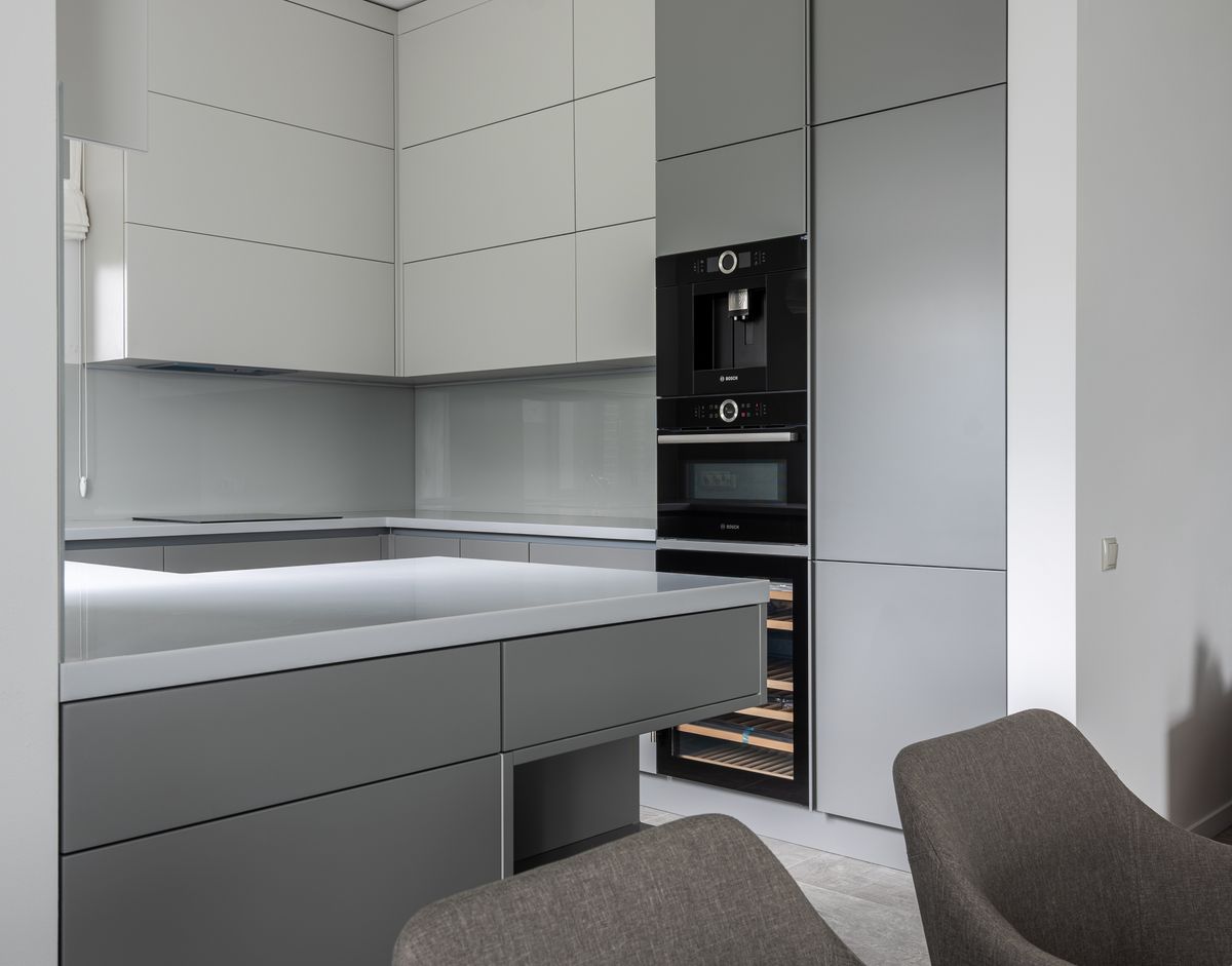
In a pale kitchen, lighting is a nice-to-have. In an anthracite kitchen it is the difference between expensive and depressing. The single most effective thing you can fit is LED strip lighting under the wall units, because it lights the worktop directly and throws light back at the doors instead of leaving them in shadow. Add spotlights or a run of pendants over an island, and put everything on a dimmer so the room can be bright at breakfast and low in the evening. Keep the bulbs warm, around 2700K, because cool white against a deep grey reads as clinical. This is one place where spending an extra hundred pounds changes the whole room.
Hardware Is Your Jewellery
Hardware Is Your Jewellery
Image source: pexels.com
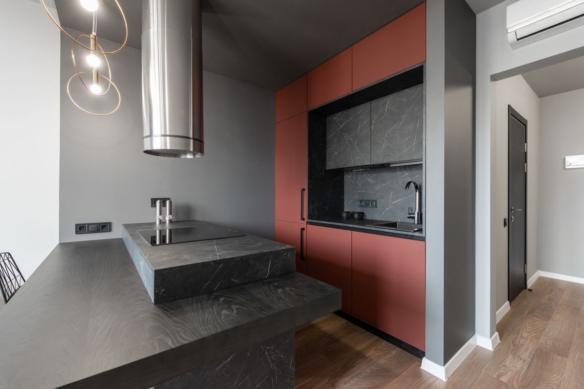
Anthracite is a plain, matte-feeling backdrop, which makes it one of the best shades in the world for handles. Brass looks genuinely rich against it. Aged or antique brass is warmer and more forgiving in an older house. Bronze does something similar with a bit more depth, which is why bronze kitchen taps have taken off alongside darker cabinetry. Brushed steel keeps things cooler and more industrial. The only rule that really matters is to pick one metal and carry it all the way through — handles, tap, light fittings, even the sockets if you can. Three different metals in one kitchen is the most common way a well-chosen colour still ends up looking accidental.
Small Kitchens: Use Less of It, Not None of It
Most UK kitchens are small, and the instinct with a small dark kitchen is to give up on the idea entirely. You do not have to. What you do is limit where it goes. Anthracite on the base units only, with white, dove grey or beige above, keeps the light moving and the room breathing. Or use it on a single run, or just the island, and keep everything else pale. Handleless doors help enormously in a small anthracite kitchen because there is no hardware interrupting the surface, so the units read as one calm block rather than twelve separate doors. Good kitchen storage ideas matter more here too, because clutter shows up far more against a dark background.
Matt or Gloss? A Real Trade-Off, Not a Trend
This is where showrooms are unhelpful, because both look perfect under shop lighting. Gloss anthracite bounces light around, which genuinely helps in a darker room, and it looks sharp and modern. It also shows every fingerprint, and on a dark colour those fingerprints are extremely visible — expect to wipe doors far more often than you would with a pale gloss. Matt anthracite is the opposite: it hides handprints beautifully and looks softer and more expensive, but it shows dust, and in a very dark room it can feel flat without good lighting. If you have young children, matt with a wipeable finish is usually the calmer choice. Ask for both samples and put them on the worktop for a week.
Colours That Bring an Anthracite Kitchen to Life
Anthracite is a backdrop, and backdrops need something in front of them. The pairings that work best are warmer or brighter than you might expect. Wood is the easiest and most reliable — floors, worktops, open shelving, a chopping board left out. After that, soft turquoise and aquamarine look wonderful against deep grey, which is why so many designers reach for them. A dusty pink does the same job more quietly. Stainless steel or a mirrored splashback adds shine without adding colour at all. What to avoid is more grey. An anthracite kitchen with grey walls, grey floor and grey stools is not a scheme, it is a weather forecast.
Flooring, Walls and the Rest of the Room
The units are only part of the picture, and getting the surroundings wrong is how a good anthracite kitchen ends up feeling heavy. Keep the floor lighter than the units in almost every case — pale timber, warm oak-effect vinyl or a light stone tile all lift the room. A black kitchen floor can look superb with anthracite, but only in a big, bright room where you can afford to lose the light. On walls, warm off-whites work better than brilliant white, which can look harsh against a deep grey. And leave one surface clear. In a dark kitchen, a stretch of empty worktop reads as calm rather than empty.
Living With It: The Bit Nobody Mentions
Anthracite is beautiful and it is honest about your housekeeping. Dust shows on matt doors, water marks show around the tap, and crumbs on a dark worktop are obvious in a way they never are on speckled granite. None of that is a reason to avoid it — it is a reason to plan for it. A microfibre cloth kept in a drawer, a tap finish that hides limescale, and a worktop that is lighter than the units all make daily life easier. People who love their anthracite kitchens tend to be the ones who chose matt doors, warm lighting and a pale worktop. People who regret them usually chose high gloss everything and a north-facing room.
Is Anthracite Still a Good Idea in 2026?
Fair question, because kitchen colour is moving. The direction of travel for 2026 is towards warmer neutrals — taupe, mushroom, stone, oat and clay — and Pantone’s Colour of the Year is Cloud Dancer, a soft airy off-white. On the face of it, that sounds like bad news for a deep grey. It is not, for two reasons. Deep grounding tones like charcoal are explicitly still part of the 2026 palette, used for depth rather than as the whole room. And the two-tone trend is built for exactly this: a dark base with a warm pale top. Anthracite paired with oat or clay above is arguably more current now than it was three years ago, when everything was grey on grey.
Final Thoughts
Anthracite is not a difficult colour, it is an honest one. It shows you immediately whether your kitchen has enough light, whether your worktop is working, and whether you own a cloth. Start with the two-tone version, put the deep grey on the base units, add warm wood and one bright metal, and fit that strip light under the wall units before you do anything else. Do that and anthracite kitchen ideas stop being something you save to a board and become the room you actually enjoy standing in. Have a look at your kitchen at 3pm today and see what the light is really doing.
Frequently Asked Questions
What colour is anthracite in a kitchen?
Anthracite is a very deep, rich grey that looks almost black in low light and softens to a warm charcoal in daylight. It is darker than standard charcoal.
Is an anthracite kitchen too dark for a small room?
Not if you limit it. Put anthracite on base units only and keep wall units white, dove grey or beige, then add under-cabinet lighting.
What worktop goes with anthracite kitchen units?
Pale marble or quartz for contrast, or warm oak and walnut for warmth. Avoid dark or heavily speckled worktops, which turn muddy against deep grey.
What handles look best on anthracite cabinets?
Brass, aged brass, bronze or brushed steel all lift it. Pick one metal and use it for handles, tap and lighting rather than mixing three.
Should I choose matt or gloss anthracite?
Gloss bounces light but shows fingerprints badly on a dark colour. Matt hides handprints and looks softer, but shows dust and needs good lighting.
Is anthracite still in style for 2026?
Yes. Deep charcoal tones remain part of the 2026 palette for grounding, and the two-tone trend pairs a dark base with warmer pale shades above.
Disclaimer
This article is for general information only. Colour appearance varies with lighting, room aspect and finish, so always order sample doors and view them in your own kitchen before ordering. Product specifications and availability change over time.