
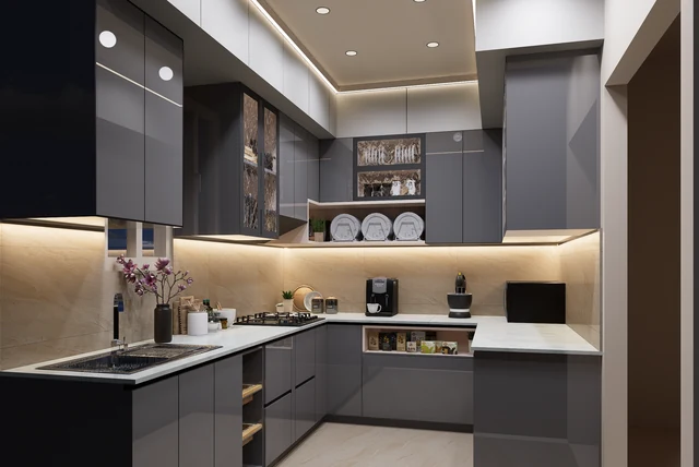

A friend spent six weekends agonising between two grey door samples that looked identical on her kitchen table. One was anthracite, one was graphite. She picked graphite almost by accident — and it turned out to be the right call for her north-facing kitchen, because graphite carries a warmth that anthracite simply does not. If you have been looking at graphite kitchen ideas UK suppliers keep showing you and wondering what actually separates all these greys, this is the one that forgives the most.
| What graphite is | A deep grey with a warm, slightly brown-leaning base |
|---|---|
| Versus anthracite | Warmer and a shade lighter; anthracite reads almost black |
| Grey’s share of UK kitchens | 21% — still the most-used kitchen colour |
| Best rooms | Works in more aspects than anthracite, including east-facing |
| Pairs beautifully with | Oak, walnut, brass, cream and off-white |
| Safest layout | Graphite base units, warm off-white above |
| Watch out for | Cool white walls, which turn graphite flat and cold |
Graphite Versus Anthracite: The Difference That Matters
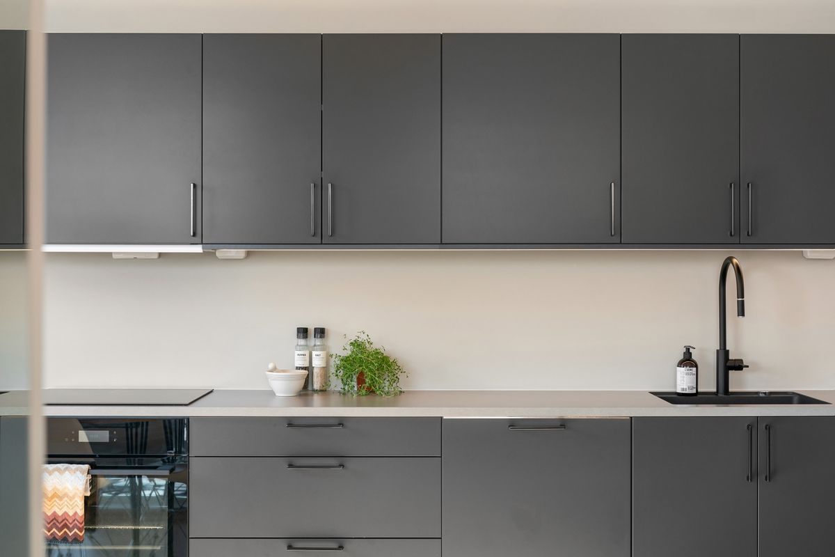
Graphite Versus Anthracite: The Difference That Matters
Image source: pexels.com
Showrooms use these words as if they mean the same thing, and they do not. Graphite is a deep grey with a warm base underneath it, often leaning very slightly brown. Anthracite is colder and darker, reading almost black in low light. Put the two samples side by side on a windowsill and the difference is obvious within a minute; put them on a table under a downlight and it is almost invisible, which is exactly how people end up with the wrong doors. That warmth is why graphite is the more forgiving of the two in a typical UK kitchen. If you want the darker, more dramatic option, our guide to anthracite kitchen ideas covers where that works better.
It Suits More Rooms Than You Expect
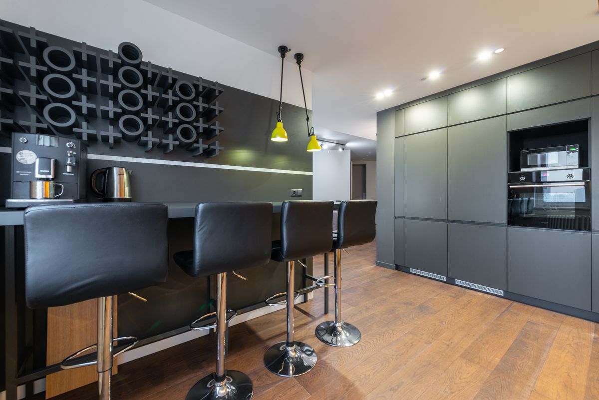
It Suits More Rooms Than You Expect
Image source: pexels.com
Deep colours generally want daylight, and that rules a lot of British kitchens out of the darkest shades. Graphite is where the warmth earns its keep. Because there is a brown undertone doing quiet work in the background, graphite holds its character in an east-facing kitchen that goes flat by three o’clock, and in a north-facing room where a cooler grey would read as grey drizzle. It is still a dark colour and it will still eat light, so it is not a free pass. But if you love deep greys and your kitchen does not face south, graphite is usually the shade that lets you have them. Test a sample on the darkest wall, not the brightest.
Wood Is Graphite’s Natural Partner
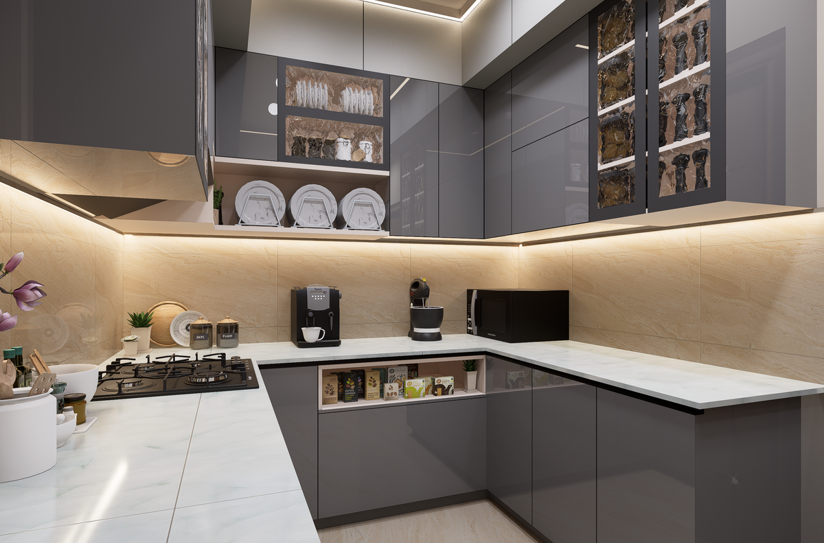
Wood Is Graphite’s Natural Partner
Image source: pexels.com
If there is one pairing to remember, it is graphite and timber. The warm undertone in the paint and the warmth in oak or walnut pull in the same direction, so the room reads as considered rather than cold. A wood worktop against graphite units is the single easiest way to make the scheme feel like a home instead of a showroom, and it works whether the wood is a full worktop, a butcher-block island top or just open shelving. The same logic is why a grey and oak kitchen has never really gone out of fashion in Britain. If you prefer stone, choose one with a warm cream or biscuit base rather than a stark white.
Two-Tone Is Still the Smartest Way to Use It
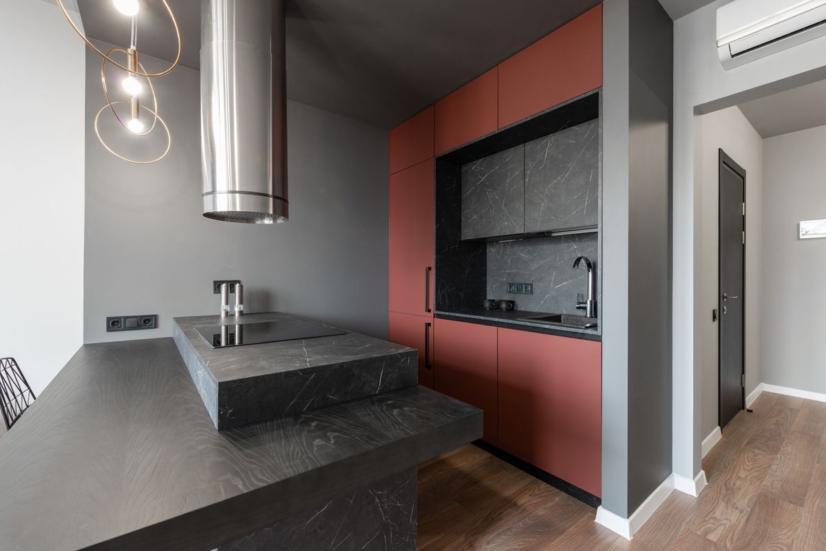
Two-Tone Is Still the Smartest Way to Use It
Image source: pexels.com
The biggest cabinet trend for 2026 is two-tone, and graphite is almost made for it. Put graphite on the base units and a warm off-white, oat or soft cream on the wall units. The dark shade at floor level lowers the visual weight of the room so the ceiling feels higher, and it hides the scuffs that collect around kick plates and door handles. Because graphite is warm, it pairs with warm whites in a way cooler greys cannot — a cool white above a cool grey below is the combination that makes kitchens look like offices. If you want more contrast, a black and grey kitchen takes the same idea further.
Hardware, Taps and Metals
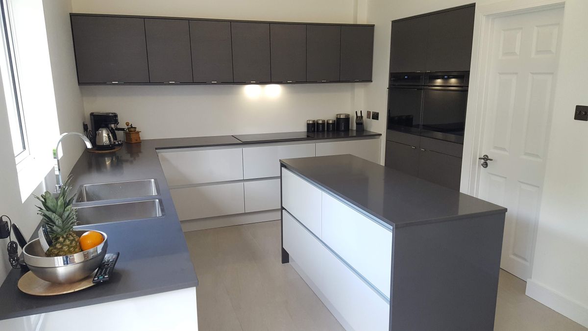
Hardware, Taps and Metals
Image source: pexels.com
Graphite is a quiet backdrop, which means whatever metal you choose becomes the detail people notice. Brass and aged brass look genuinely expensive against it and pick up the warm undertone beautifully. Bronze does something similar with a little more depth, which is why bronze kitchen taps have become such a common choice alongside darker cabinetry. Matt black works and reads more modern, though it can flatten the scheme if the worktop is also dark. Whatever you pick, use one metal throughout — handles, tap, lighting, even the sockets. Mixing brass handles with chrome lights is the most common way a well-chosen colour still ends up looking accidental.
Lighting: Warm, Layered and Under the Wall Units
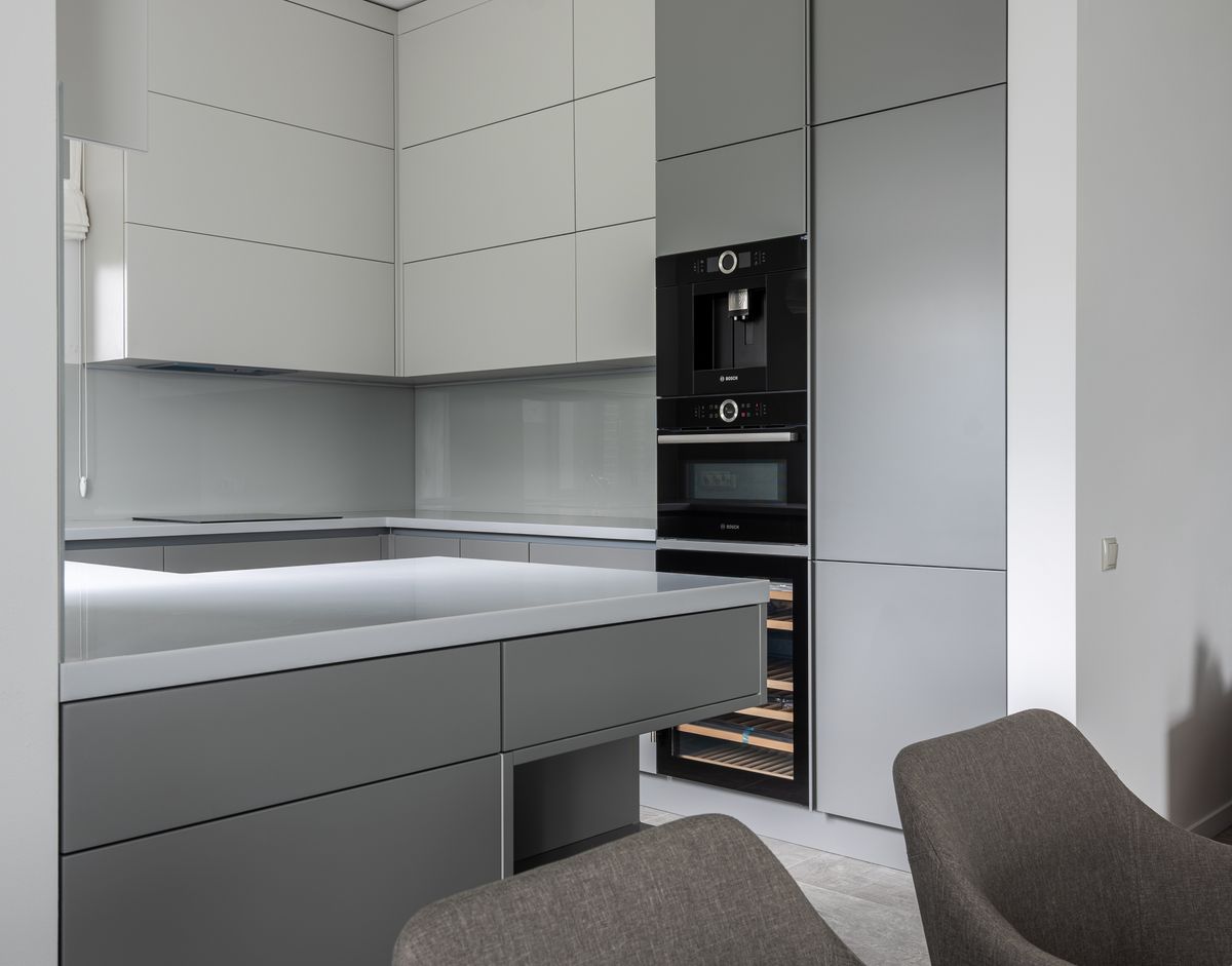
Lighting: Warm, Layered and Under the Wall Units
Image source: pexels.com
Every dark kitchen lives or dies on its lighting, and the single most useful fitting is an LED strip under the wall units. It lights the worktop where you actually work and throws light back onto the doors instead of leaving them in shadow. Add spots or pendants over an island, put everything on a dimmer, and keep the bulbs warm at around 2700K. Cool white against graphite kills the warm undertone that made you choose it in the first place, and the room immediately looks like a showroom at closing time. This is one of the few places in a kitchen where a modest spend genuinely changes how the whole room feels after dark.
Small Kitchens: Use It on the Base Units Only
Most UK kitchens are compact, and a small room in wall-to-wall graphite becomes a cave very quickly. The fix is not to abandon the colour but to ration it. Graphite on the base units with white, cream or a pale warm grey above keeps light moving around the room while still giving you the depth you wanted. Handleless doors help enormously here, because with no hardware breaking up the surface the units read as one calm block rather than a row of separate doors. Sensible kitchen storage ideas matter more too, since clutter shows up far more against a dark background than a pale one.
Matt or Gloss, and What You Will Actually Live With
Both look perfect under showroom lighting and behave very differently at home. Gloss graphite bounces light around, which genuinely helps a darker room, and it looks sharp. It also shows fingerprints, and on a dark door those prints are obvious from across the room. Matt graphite is softer, hides handprints and looks more expensive, but it shows dust and needs decent lighting to avoid looking flat. In a house with small children, matt with a wipeable finish is usually the calmer life. Ask for both samples, leave them on the worktop for a week, and see which one annoys you less by Friday.
Walls, Floors and the Rest of the Room
Getting the surroundings wrong is how a good graphite kitchen ends up feeling heavy. On walls, warm off-whites, oat and soft clay all work; brilliant white fights the undertone and makes the units look grey and cold. On floors, go lighter than the units in almost every case — pale oak, warm oak-effect vinyl or a biscuit-toned tile all lift the room. A black kitchen floor can look superb with graphite, but only in a large, bright kitchen where you can afford to lose the light. And leave one stretch of worktop clear; in a dark kitchen, empty surface reads as calm.
Is Graphite Still a Good Choice for 2026?
Kitchen colour is moving towards warmth. The 2026 palette is full of taupe, mushroom, stone, oat and clay, and Pantone’s Colour of the Year is Cloud Dancer, a soft airy off-white. On paper that sounds like bad news for a deep grey, and for the colder greys it probably is. Graphite is the exception, precisely because of that warm base — it sits comfortably next to oat and clay in a way an icy grey never will. Pair graphite base units with a warm off-white above and you are following the two-tone trend and the warm-neutral trend at the same time. It is arguably a better fit now than it was when everything was grey on grey.
Living With a Graphite Kitchen
Dark kitchens are honest about housekeeping, and it is better to know that before you order. Dust settles visibly on matt doors, water marks show around the tap, and crumbs on a dark worktop are obvious in a way they never are on speckled granite. None of that is a reason to avoid graphite; it is a reason to plan around it. Keep a microfibre cloth in a drawer, choose a tap finish that hides limescale, and pick a worktop lighter than the units. The people who love their dark kitchens tend to be the ones who chose matt doors, warm lighting and a pale worktop. The ones who regret them usually chose high gloss everything.
Final Thoughts
Graphite is the grey for people who want depth without gloom. It is warmer than anthracite, kinder to rooms that do not face south, and it sits happily beside the oat and clay tones that are defining 2026. Put it on the base units, add oak and one warm metal, fit a strip light under the wall units, and keep the walls off-white rather than brilliant white. Do that and graphite kitchen ideas stop being samples on your table and become a room you are glad to walk into. Take a sample home before you decide.
Frequently Asked Questions
What is the difference between graphite and anthracite kitchens?
Graphite is warmer and slightly lighter, with a brown-leaning base. Anthracite is cooler and darker, reading almost black in low light.
Is a graphite kitchen too dark for a small room?
Not if you limit it. Use graphite on base units with cream or warm white above, and fit under-cabinet lighting to keep the worktop bright.
What worktop suits graphite kitchen units?
Wood is the easiest and warmest partner. If you prefer stone, choose a warm cream or biscuit base rather than a stark white.
What wall colour goes with a graphite kitchen?
Warm off-whites, oat and soft clay. Brilliant white fights the warm undertone and makes graphite look cold and flat.
Should I pick matt or gloss graphite doors?
Gloss bounces light but shows fingerprints clearly on a dark colour. Matt hides handprints and looks softer, but shows dust and needs good lighting.
Is graphite still in style for 2026?
Yes. Its warm base sits comfortably with the 2026 warm-neutral palette, and it works well as the darker half of a two-tone kitchen.
Disclaimer
This article is for general information only. Colour appearance varies with lighting, room aspect and finish, so always order sample doors and view them in your own kitchen before ordering. Product specifications change over time.