
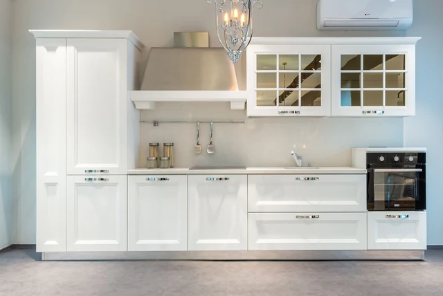

Brilliant white kitchens photograph beautifully and can feel oddly unwelcoming on a wet Tuesday in February. That is the gap ivory fills. It is white, so the room stays bright, but there is enough warmth in it that the kitchen still feels like somewhere you would sit with a cup of tea. If you have been circling ivory kitchen ideas UK showrooms keep filing under “cream”, it is worth knowing they are not the same thing — and the difference decides whether your kitchen looks calm or dated.
| What ivory is | A soft warm white with a yellow-cream base, never stark |
|---|---|
| Versus cream | Ivory is paler; cream carries more yellow |
| Versus brilliant white | Ivory is warmer and far kinder in low UK daylight |
| White’s share of UK kitchens | 19% — second only to grey at 21% |
| 2026 direction | Warm off-whites are rising; Pantone’s 2026 colour is Cloud Dancer |
| Best rooms | Excellent in north-facing and low-light kitchens |
| Watch out for | Cool grey worktops, which turn ivory yellow by contrast |
Ivory, Cream and White Are Three Different Things
Ivory, Cream and White Are Three Different Things
Image source: pexels.com
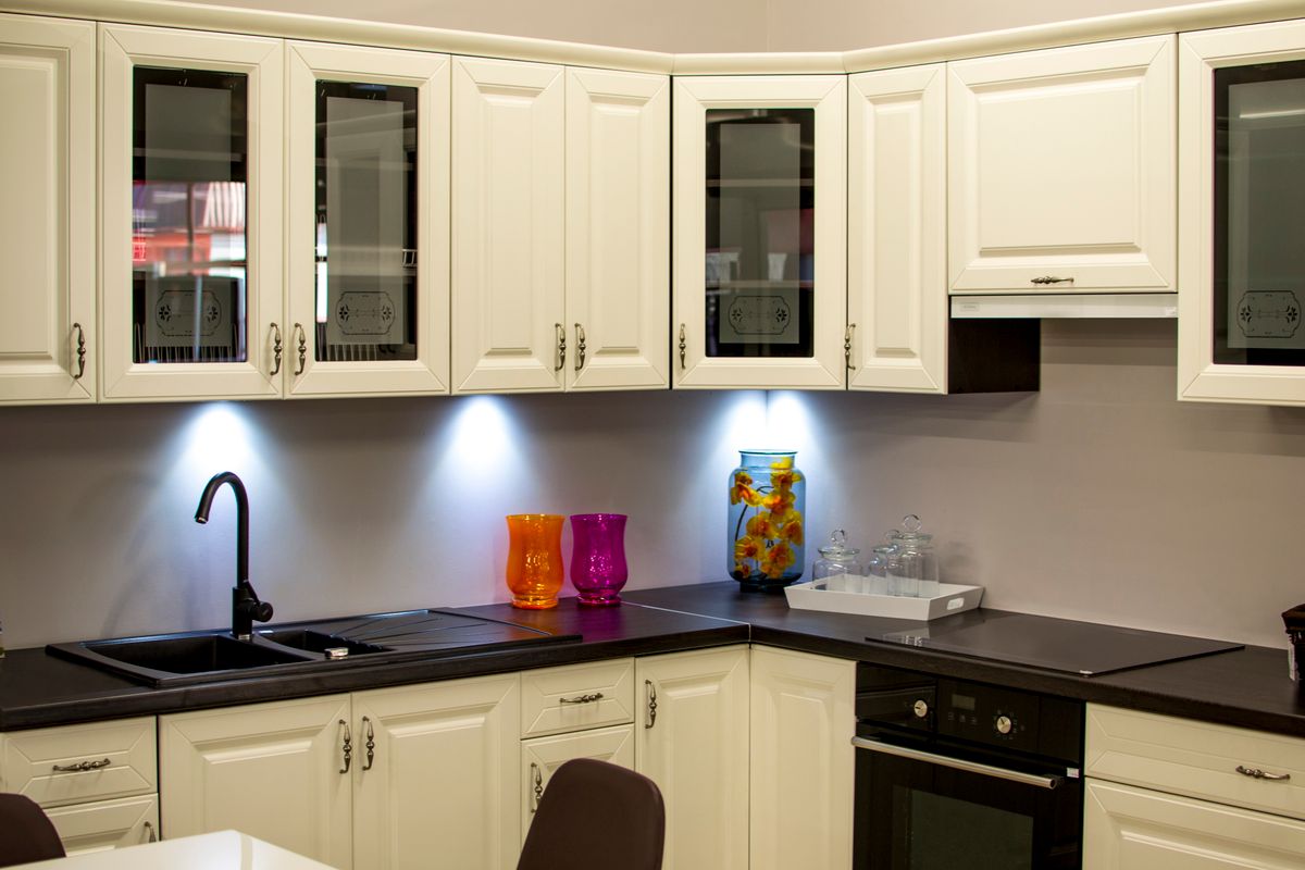
This trips up more people than any other kitchen colour decision. Brilliant white is a pure, cool white with no undertone. Cream is noticeably yellow and reads as traditional, sometimes dated. Ivory sits between them: a soft warm white with just enough yellow in the base to take the chill off, without tipping into buttermilk. On a sample card in a bright showroom all three look similar. In a real kitchen at four o’clock in November they look nothing alike. Order all three samples, prop them against the wall you actually look at, and the decision usually makes itself within a day.
Why Ivory Suits British Light
Why Ivory Suits British Light
Image source: pexels.com
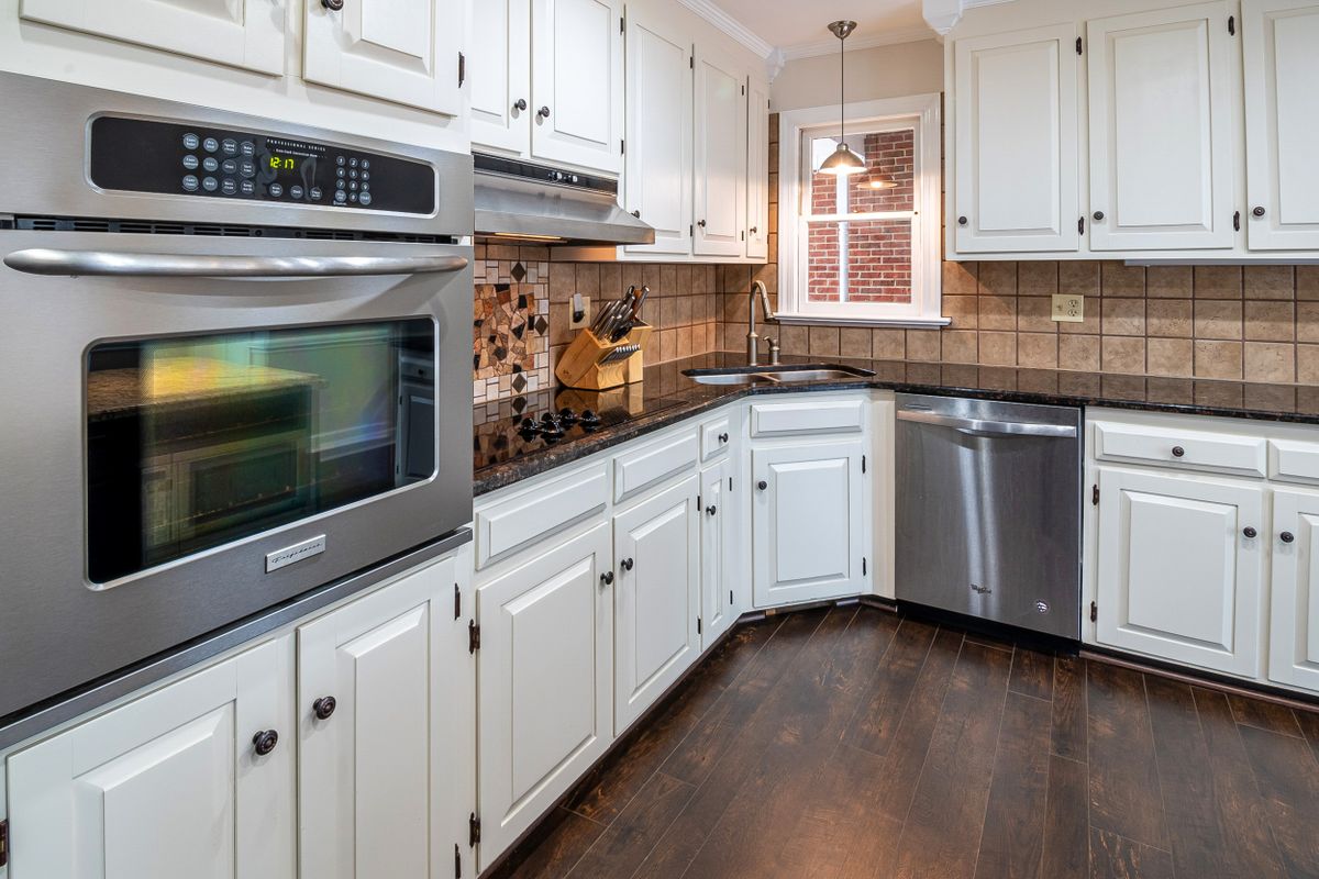
Most UK kitchens are not flooded with sunshine, and that is precisely where brilliant white struggles. Cool white needs strong daylight to look crisp; give it a grey afternoon and it turns slightly blue and clinical. Ivory has warmth built into it, so it holds its softness even when the weather is doing nothing for you. That makes it one of the most reliable choices for a north-facing kitchen, a galley with one small window, or a room that borrows its light from next door. It brightens without going cold, which is a genuinely difficult combination to get from any other colour family.
Worktops That Flatter Ivory
Worktops That Flatter Ivory
Image source: pexels.com
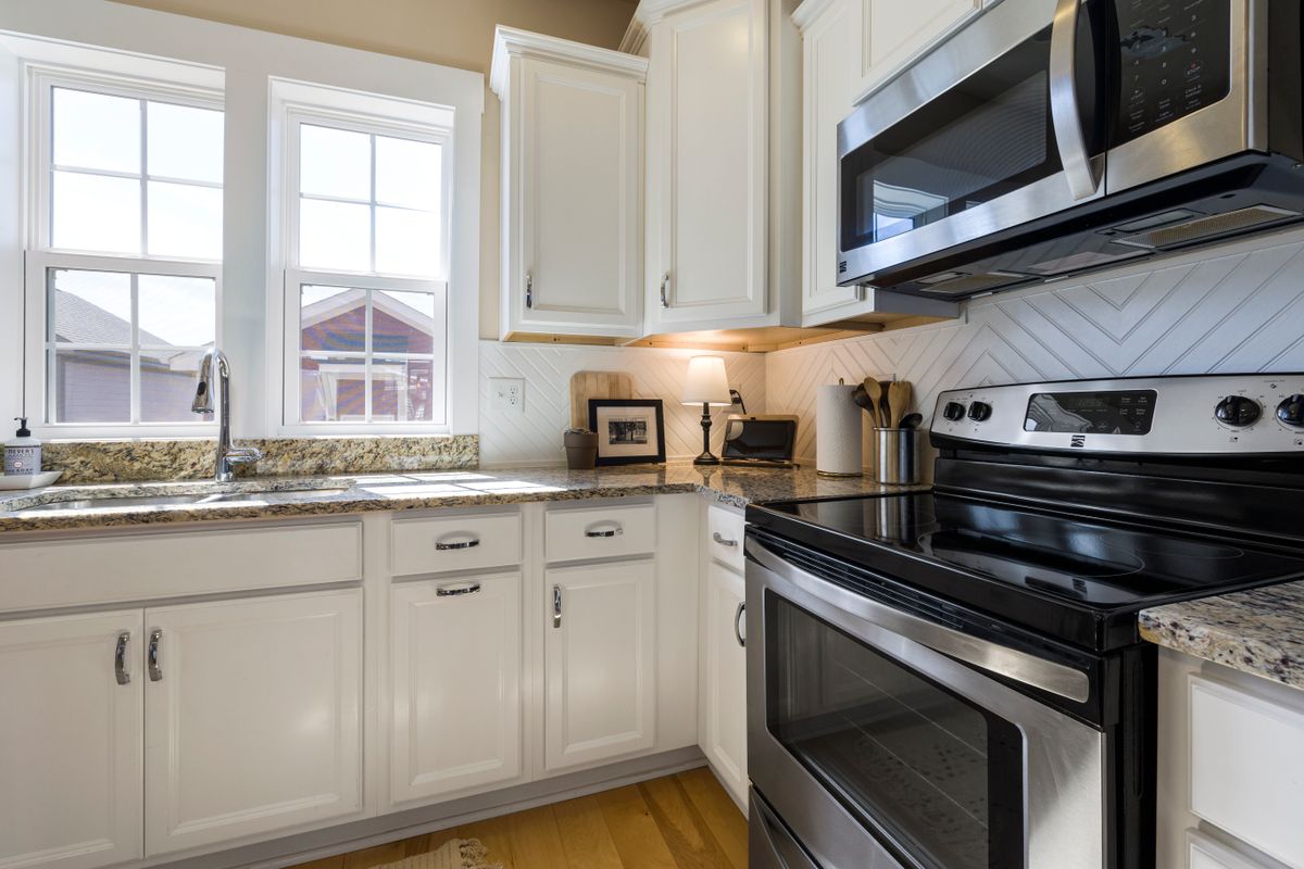
The worktop is where ivory kitchens are usually won or lost. The mistake is pairing ivory with a cool grey quartz, because the grey pulls the yellow out of the ivory and suddenly the doors look dated rather than warm. What works is either warmth or genuine contrast. Timber is the easy answer — oak against ivory is soft, classic and forgiving. Warm-toned quartz with a cream or biscuit base keeps things light. At the other end, a dark worktop gives you crisp definition and stops the room feeling washed out, which is why ivory units with a deep worktop is such a common combination in UK homes.
Hardware and Taps: Warm Metals Win
Hardware and Taps: Warm Metals Win
Image source: pexels.com
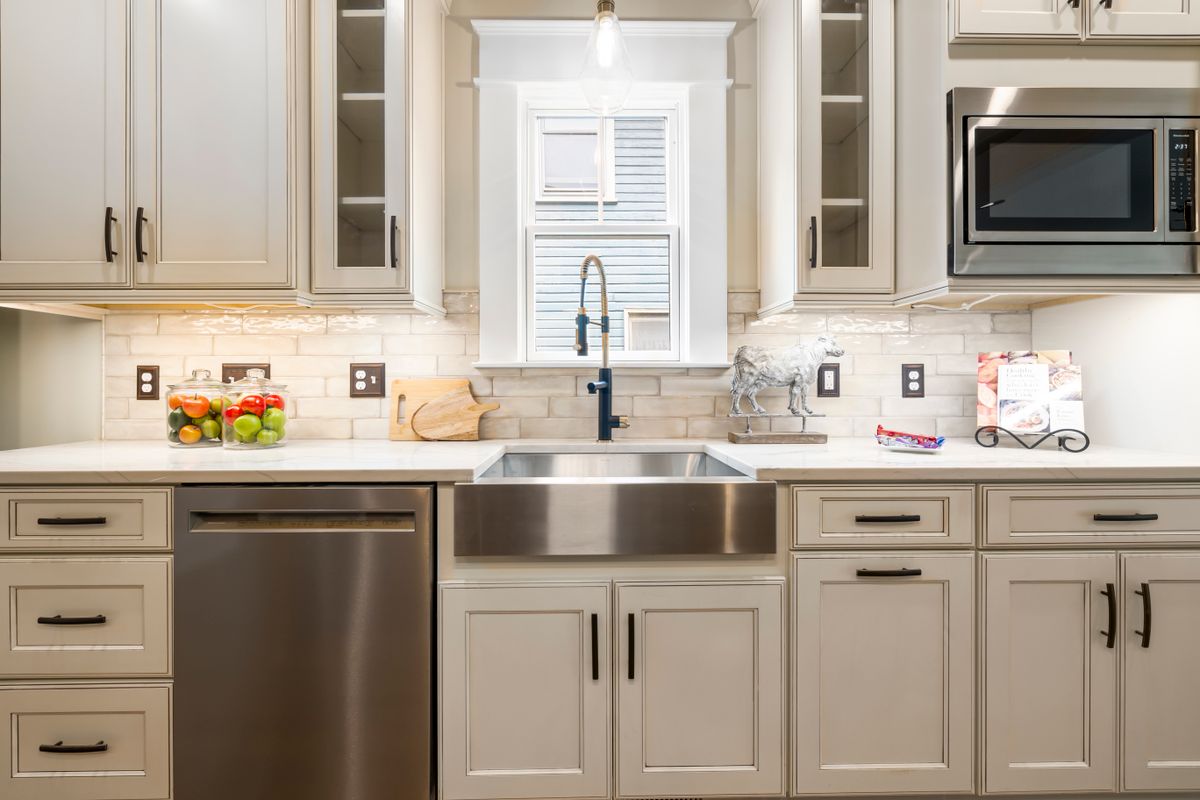
Ivory is a warm colour, so it wants warm metal beside it. Brass, aged brass and brushed gold all look expensive against ivory and pick up the undertone rather than fighting it. Bronze does the same with more depth, which is why bronze kitchen taps suit ivory just as well as they suit darker cabinetry. Chrome is not wrong, but it is cooler and tends to make ivory look slightly yellow by comparison. Matt black is the modern option and works best when something else in the room is also black, such as the tap and the light fittings, so it reads as deliberate rather than as one odd handle choice.
Two-Tone: Ivory Above, Something Deeper Below
Two-Tone: Ivory Above, Something Deeper Below
Image source: pexels.com
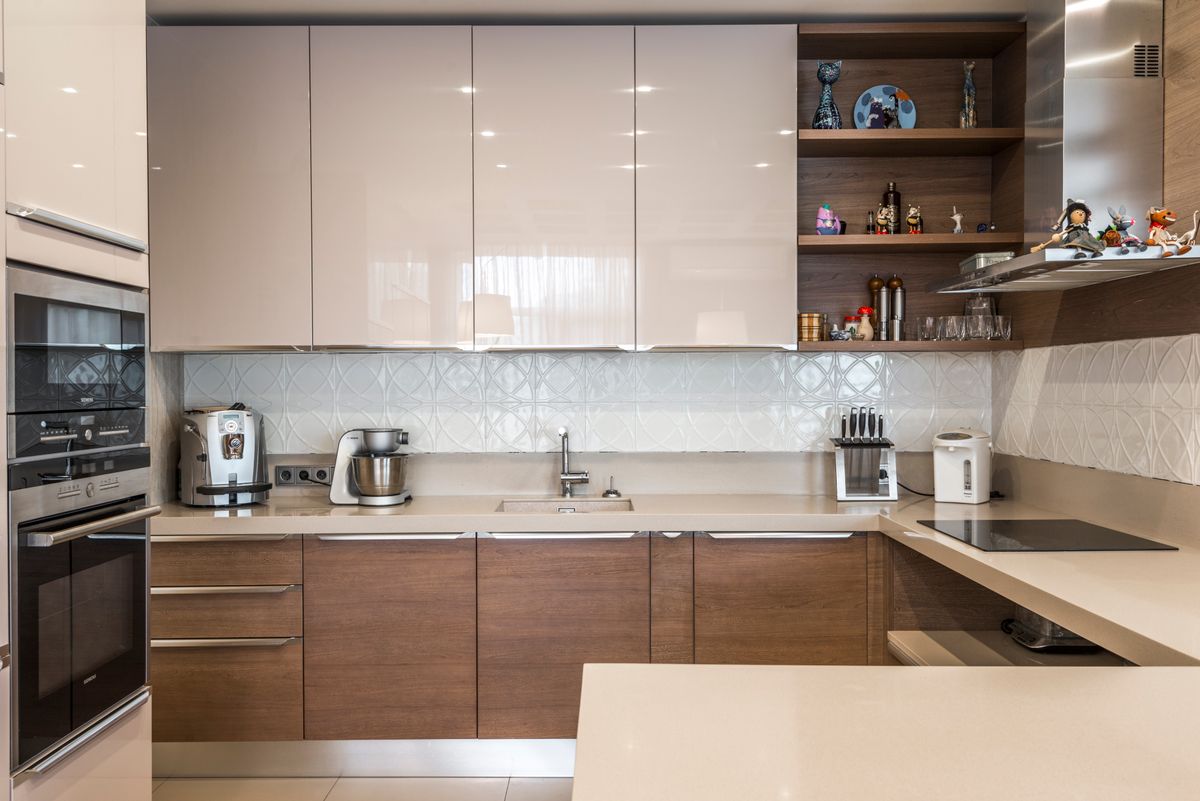
The biggest kitchen trend for 2026 is two-tone cabinetry, and ivory is the obvious candidate for the upper half. Ivory wall units with a deeper shade on the base — sage, olive, navy, graphite or clay — gives you brightness at eye level and grounding at floor level. It also hides scuffs where they actually happen. Ivory works particularly well above warm darks because the undertones agree with each other; it is less happy above an icy grey. If you like the idea but want the darker shade explained first, our guide to anthracite kitchen ideas covers the deepest end of that pairing.
Keeping an Ivory Kitchen Looking Clean
Keeping an Ivory Kitchen Looking Clean
Image source: pexels.com
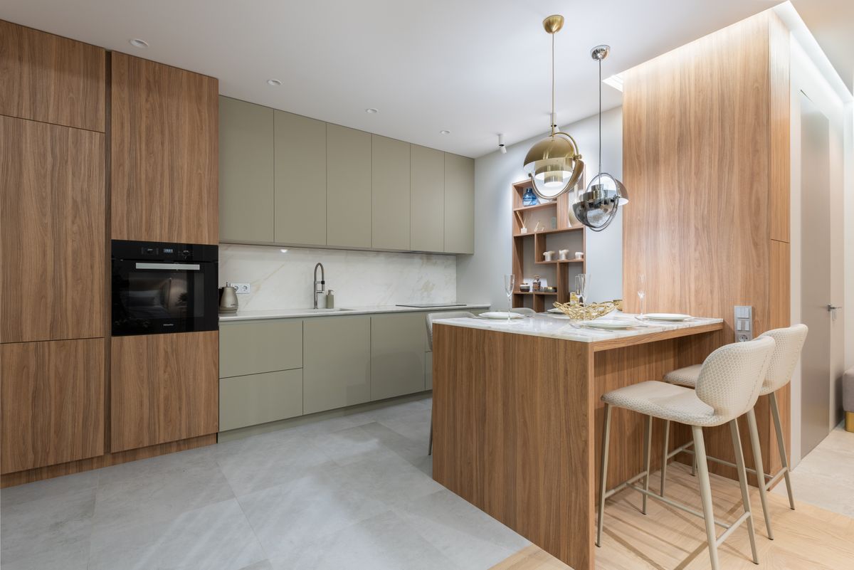
This is the honest part. Pale kitchens show marks, and around a kitchen the marks are specific and predictable: the cupboard beside the hob, the door under the sink, the drawer you open with a wet hand, and the edge nearest the bin. None of that is a reason to avoid ivory, but it is a reason to choose a wipeable finish rather than a chalky matt, and to keep a small amount of the original paint or a touch-up pen somewhere sensible. Ivory has one real advantage over brilliant white here: because it already carries warmth, the faint yellowing that affects every pale kitchen over time is far less obvious.
Small Kitchens and Galley Layouts
Ivory is one of the best colours available for a small UK kitchen, because it does the brightening job of white without the coldness that makes a tight room feel clinical. Run it on both base and wall units in a galley to keep the space reading as one continuous surface, and use handleless or slim-profile handles so nothing breaks it up. Keep the worktop light too, and let a single darker element — the floor, a splashback, the tap — provide the contrast. Practical kitchen storage ideas matter here as well, since a small pale kitchen looks its best when the worktops are clear.
Shaker, Handleless or Glass-Fronted
Ivory suits almost every door style, which is part of why it lasts. On a shaker door the frame casts a soft shadow line that gives the colour depth, which is why ivory shaker is such a safe choice in a period property. On flat handleless slabs ivory reads modern and calm rather than stark. Glass-fronted wall units in ivory are worth considering if you have anything worth showing, because the warm frame stops the glass looking like an afterthought. What ivory does not love is a high-gloss finish, which tends to make the yellow undertone obvious and can look cheap under downlights.
Walls, Floors and Finishing the Room
Painting the walls the same ivory as the units usually flattens everything, so give them their own tone. A soft oat, a warm stone or a gentle greige all sit well beside ivory without competing. On floors, warm wood is the classic answer and terracotta or biscuit-toned tile works beautifully in a country kitchen. Avoid cool grey flooring, which drags the whole scheme in two directions at once. For the splashback, a warm-toned tile or a timber shelf keeps the warmth going, while a dark tile gives you the contrast that stops a very pale kitchen looking unfinished.
Is Ivory the Right Choice for 2026?
Very much so, and arguably more than at any point in the last decade. The whole direction of kitchen colour for 2026 is away from cool whites and cold greys and towards warm neutrals — taupe, mushroom, stone, oat and clay. Pantone’s Colour of the Year is Cloud Dancer, a soft airy off-white, which is essentially the same instinct. Ivory is the cabinet version of that idea and has the advantage of never having been a trend colour in the first place, so it is unlikely to date the way a strong fashion shade will. If you want a kitchen that still looks right in ten years, this is a sensible place to land.
Final Thoughts
Ivory gives you a bright kitchen without the chill, which is exactly what most British homes need in the six months of the year when the light is poor. Keep the metals warm, avoid cool grey worktops, choose a wipeable finish, and let one darker element do the contrast. Get those four things right and ivory kitchen ideas turn into a room that feels calm rather than clinical. Take three samples home — white, cream and ivory — and look at them at dusk before you decide.
Frequently Asked Questions
What is the difference between ivory and cream kitchens?
Ivory is a paler, softer warm white. Cream carries noticeably more yellow and reads as more traditional, which is what can make it feel dated.
Is ivory better than white for a small kitchen?
Usually yes in the UK. Ivory brightens like white but keeps warmth, so a small low-light kitchen feels welcoming rather than clinical.
What worktop goes with ivory kitchen units?
Wood or a warm cream-based quartz, or a dark worktop for contrast. Avoid cool grey, which pulls the yellow out of ivory and dates it.
What handles suit an ivory kitchen?
Warm metals such as brass, aged brass, brushed gold or bronze. Chrome is cooler and can make ivory look slightly yellow by comparison.
Do ivory kitchens show dirt?
Pale kitchens show marks around the hob, sink and bin. Choose a wipeable finish and keep touch-up paint, though ivory hides age-yellowing better than white.
Is ivory in style for 2026?
Yes. The 2026 palette moves towards warm neutrals and off-whites, and Pantone’s Colour of the Year, Cloud Dancer, follows the same instinct.
Disclaimer
This article is for general information only. Colour appearance varies with lighting, room aspect and finish, so always order sample doors and view them in your own kitchen before ordering. Product specifications change over time.