
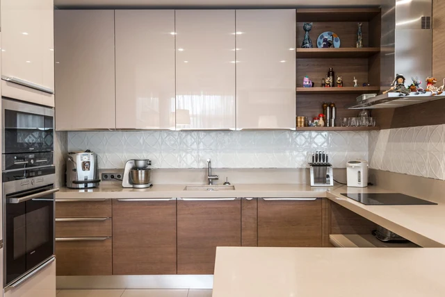

My neighbour ripped out a grey kitchen after only six years. Nothing was broken. She just said walking into it in January felt like walking into a car park. She replaced it with taupe, kept everything else the same, and the room went from cold to calm overnight. That is the quiet appeal behind the taupe kitchen ideas UK homeowners are suddenly asking for: all the neutrality of grey, none of the chill. It is the shade fixing the mistake a decade of grey kitchens made.
| What taupe is | A neutral that blends grey and brown, often with a faint pink, purple or green undertone |
|---|---|
| Taupe vs greige | Greige is grey plus beige and sits lighter; taupe carries more brown |
| Taupe vs mushroom | Mushroom is a taupe with a stronger brown-grey balance; the terms overlap heavily |
| Why it is rising | 2026 is moving away from cold grey and stark white toward warm neutrals |
| Best hardware | Gold, brass, burnished metal or matt black |
| Best worktop partner | Natural oak, or white for a bright contrast |
| Finish tip | Matt or lightly grained surfaces maximise the warmth |
Taupe, Greige and Mushroom Are Not the Same Thing
Taupe, Greige and Mushroom Are Not the Same Thing
Image source: pexels.com
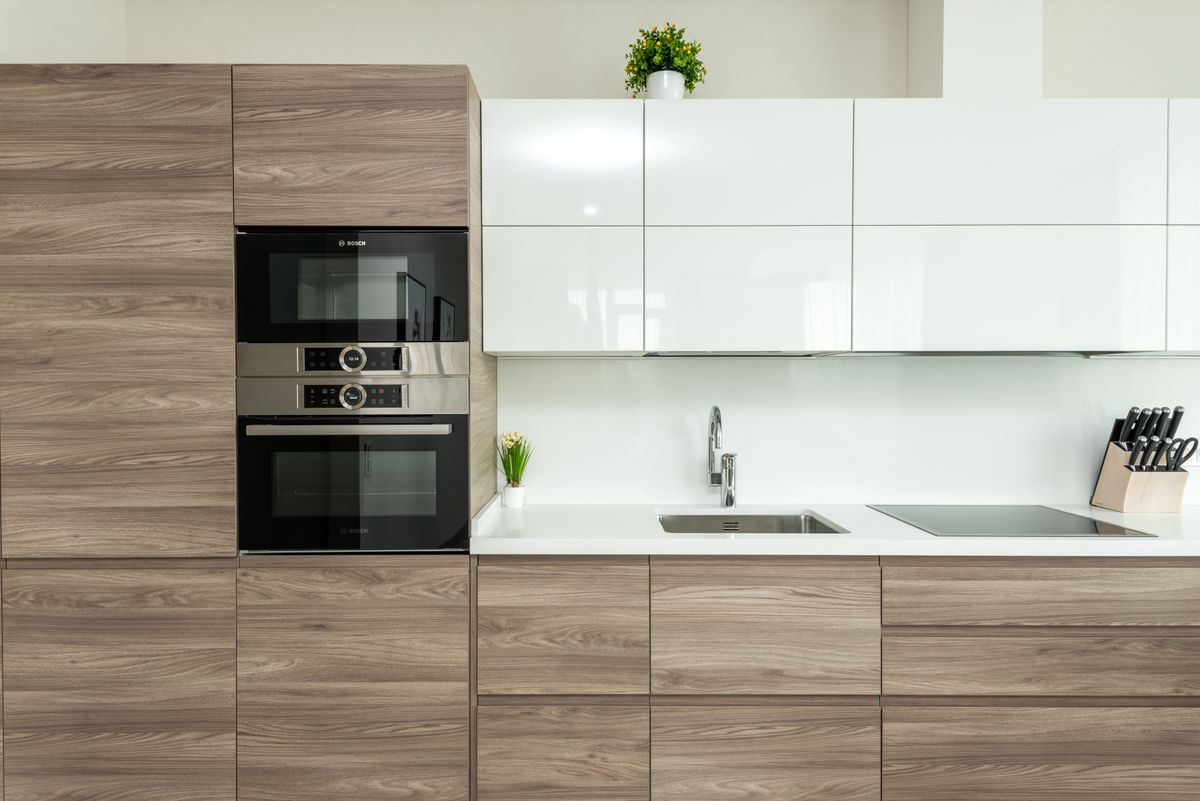
Start here, because these three words get used interchangeably by showrooms and they describe genuinely different doors. Taupe is a neutral that blends grey and brown, usually with a faint undertone of pink, purple or green sitting underneath. Greige is exactly what it sounds like, grey plus beige, and it sits lighter and cooler than taupe. Mushroom leans further into the brown-grey balance and can look almost fawn in strong daylight. On a sample card in a bright showroom they are near identical. In a British kitchen at four o’clock on a grey afternoon, the difference is obvious. Order all three and prop them against the wall you actually look at.
Why Taupe Is Having a Moment in 2026
Why Taupe Is Having a Moment in 2026
Image source: pexels.com
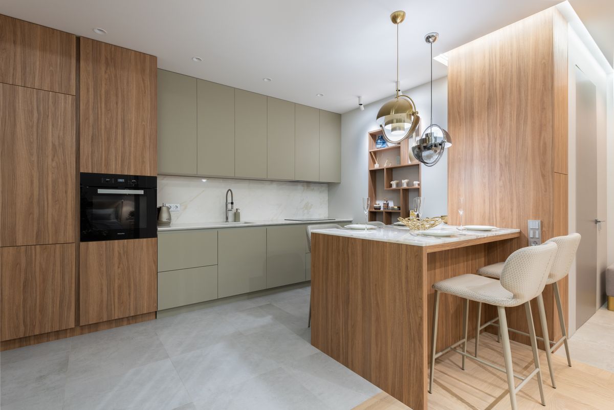
For about a decade British kitchens went grey, and a lot of them went cold grey. The shift for 2026 is firmly away from that: taupe, mushroom, stone, oat and clay have become the staples, and the mood is warmth without losing the clean, modern feel people liked about grey in the first place. Taupe is the centre of that movement because it keeps the neutrality of grey while removing the chill. It is also genuinely low-risk, because it was never a fashion colour — unlike a strong shade, it is unlikely to date your kitchen in five years. If you want the darker end of the same instinct, graphite kitchen ideas sit in the same warm family.
Taupe and Wood Are Best Friends
Taupe and Wood Are Best Friends
Image source: pexels.com
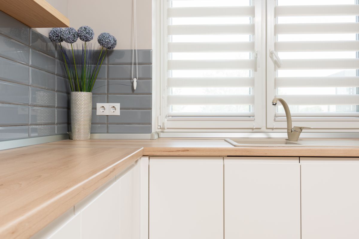
If there is one pairing that makes taupe sing, it is timber. A rich oak island against taupe perimeter cabinets creates a texture-heavy look that reads as expensive without any expensive materials, and natural oak worktops with warm taupe or mushroom units is one of the most reliable combinations in modern UK kitchens. The reason is simple: both carry warmth, so nothing fights. Butcher block does the same job at a lower price and suits a more relaxed kitchen. Even a small amount of wood helps — open shelving, a chopping board left out, timber handles. If you like the idea but want the classic version, a grey and oak kitchen is the cooler cousin of the same idea.
Worktops: White for Bright, Wood for Warm
Worktops: White for Bright, Wood for Warm
Image source: pexels.com
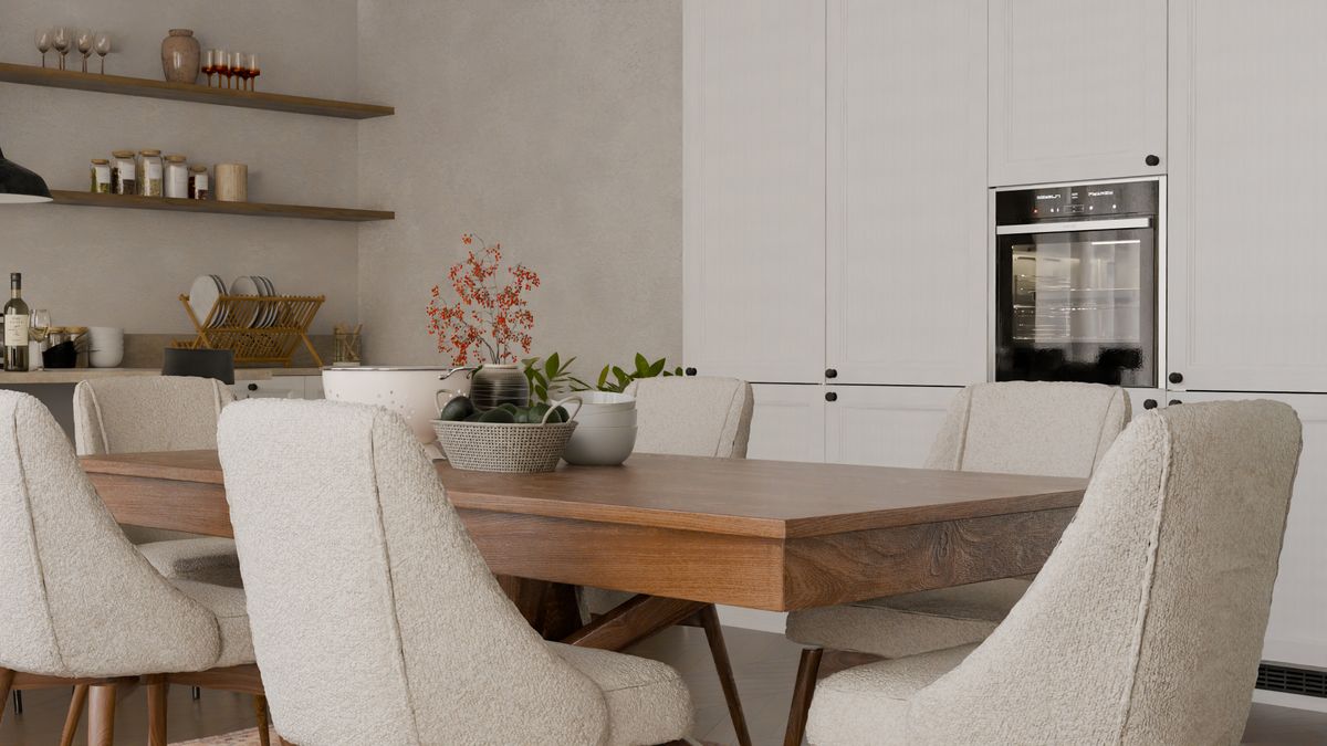
Taupe is unusually easy to pair, which is part of the appeal. White worktops give you a crisp, bright line above the units and keep a smaller kitchen feeling open. Wood does the opposite, wrapping the room in warmth. Marble backsplashes and white countertops both work happily alongside taupe cabinets with black hardware. What to avoid is a cold, blue-grey quartz, which drags taupe towards looking muddy by contrast and undoes the warmth you chose it for. If you are torn, a warm-toned quartz with a cream or biscuit base is the safe middle ground and photographs well in a north-facing room.
Hardware: Gold, Brass and Matt Black
Hardware: Gold, Brass and Matt Black
Image source: pexels.com
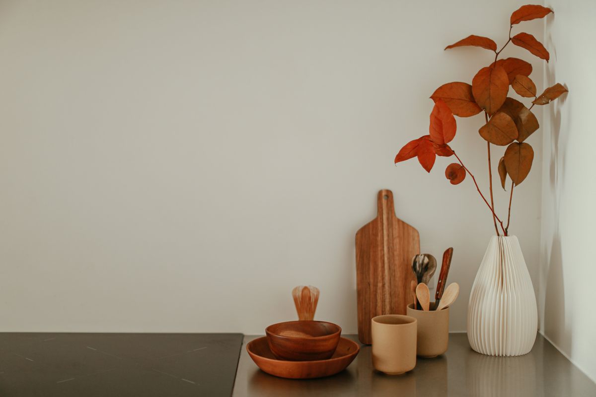
Taupe is a soft backdrop, and that makes the metal you choose the detail people actually notice. Gold and brass are the standout pairing, giving a refined, contemporary look with genuine contrast; burnished and antique finishes suit older houses and hide fingerprints better than polished brass. Matt black is the modern alternative and reads sharper, though it works best when something else in the room is also black. Chrome is not wrong but it is cool, and against a warm neutral it tends to look like an afterthought. Bronze kitchen taps are worth a look too, since bronze picks up taupe’s brown undertone almost perfectly.
Two-Tone: Taupe Below, Pale Above
Two-Tone: Taupe Below, Pale Above
Image source: pexels.com
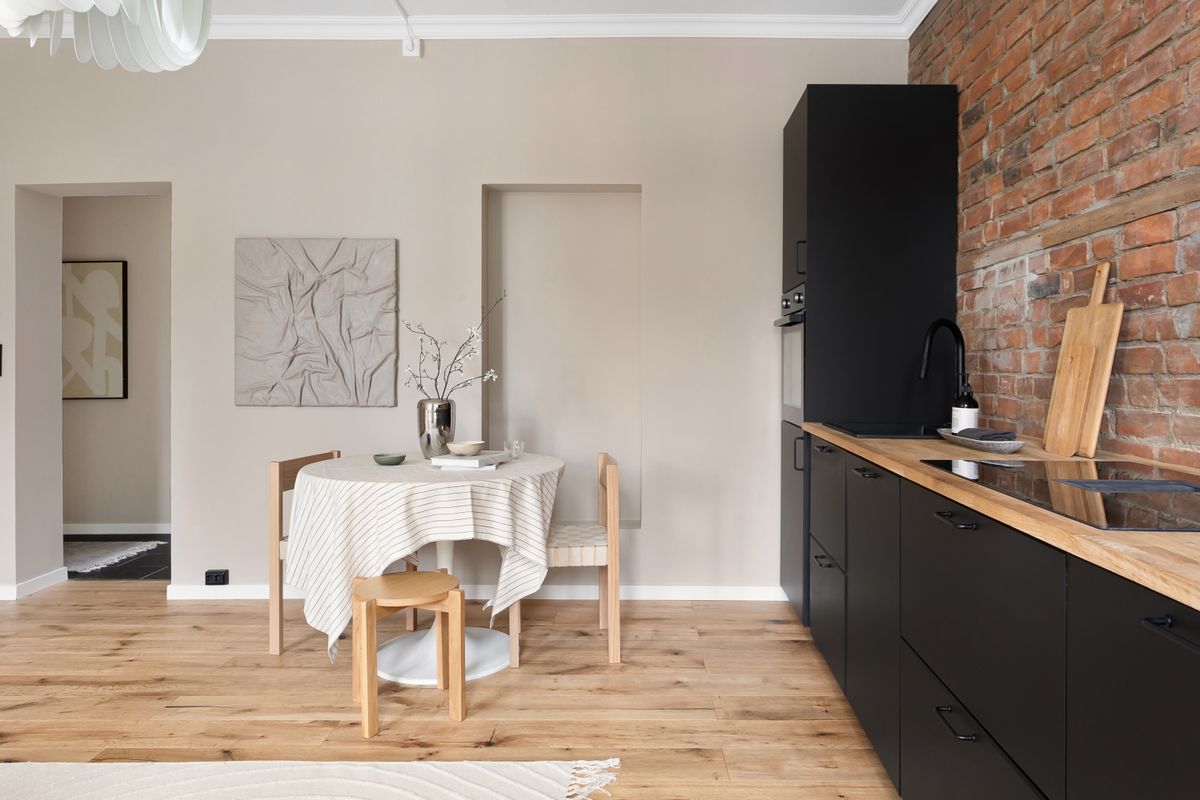
The single biggest cabinet trend for 2026 is two-tone, and taupe is one of the easiest shades to build it around. Combining taupe lower cabinets with white uppers and white countertops creates a bright, balanced and timeless palette, and it does something practical too: the deeper shade at floor level hides the scuffs that collect around kick plates while the pale top half keeps the room feeling tall. It also works in reverse in a very light room, with taupe above and a deeper clay or olive below. If you want the palest possible upper half, ivory kitchen ideas pair beautifully with a taupe base.
Texture Matters More Than With Any Other Neutral
This is the part people miss. Taupe on a flat, shiny door can look oddly lifeless, because gloss reflects light evenly and flattens the subtle undertone that makes the colour interesting. Keep the materials matt or lightly grained and the warmth comes through properly. A grained or woodgrain-effect taupe door gives you colour and texture at once and is very forgiving in a busy family kitchen. The same logic applies across the room: a honed rather than polished worktop, a matt tile, a linen blind. In a neutral scheme, texture is doing the job that colour does elsewhere, and without it the kitchen can read as bland.
Which Rooms Suit Taupe
Taupe is one of the most flexible colours available, which is why it works across so many UK homes. In a north-facing kitchen, the brown undertone stops it going cold in the way a true grey does. In a south-facing room, the same undertone keeps it from bleaching out under strong light. It suits period properties, where it sits happily beside original timber and warm stone, and it suits new-builds, where it softens what can otherwise be a very flat, white box. The one situation to be careful about is a room with strong existing cool greys — a grey floor or a blue-grey worktop will pull taupe in an unflattering direction.
Small Kitchens and Galley Layouts
Taupe is a good friend to a small kitchen because it is light enough to keep a room feeling open while being far more forgiving of marks than white. A very pale, creamy taupe keeps the room airy but feels much more intentional than basic eggshell white, which is exactly what a small galley needs. Run it on both base and wall units to keep the space reading as one continuous surface, choose handleless or slim handles so nothing interrupts it, and let one darker element such as the floor or a splashback do the contrast. Clear worktops matter here, so sensible kitchen storage ideas are worth planning at the same time.
Walls, Floors and Finishing the Scheme
Painting the walls the same taupe as the cabinets usually flattens everything, so give the walls their own tone — a soft oat, a warm off-white or a gentle stone all sit well without competing. On floors, warm timber is the natural partner; terracotta and biscuit-toned tile work beautifully in a country kitchen. Cool grey flooring is the one to avoid, because it pulls against the warmth and leaves the room feeling undecided. For a splashback, a marble or a warm-toned tile keeps the softness going, while a bold patterned tile is a genuinely good idea here — taupe is calm enough to carry a strong pattern without the room becoming busy.
Living With Taupe
This is where taupe quietly beats both white and dark grey. It is pale enough that crumbs and water marks do not announce themselves the way they do on a dark worktop, and warm enough that the faint yellowing every pale kitchen picks up over the years is far less obvious than it is on brilliant white. Matt finishes hide handprints well, which is the main complaint about gloss. The practical advice is the same as for any kitchen: keep a little of the original paint or a touch-up pen for the door beside the bin and the one under the sink, which are always the first two to show wear.
Is Taupe a Safe Choice Long Term?
About as safe as kitchen colour gets, for a reason worth understanding. Trend colours date because they are recognisable — you can name the decade a kitchen was fitted from its colour. Taupe is a neutral, so it does not carry that signature, and the current movement towards warm neutrals suggests it will feel current rather than dated for some time yet. If you want extra insurance, keep the taupe on the cabinets and put any fashionable colour somewhere cheap to change: a splashback, a blind, the walls, the stools. Then in five years you update a hundred pounds of accessories rather than a kitchen.
Final Thoughts
Taupe is the neutral that finally fixed what people disliked about grey kitchens: the coldness. Pair it with oak, choose brass or matt black hardware, keep the finish matt rather than gloss, and let one element provide contrast. Do that and taupe kitchen ideas turn into a kitchen that feels warm on a grey Tuesday and still looks current in five years. Take three samples home — taupe, greige and mushroom — and look at them at dusk before you decide.
Frequently Asked Questions
What colour is taupe in a kitchen?
Taupe blends grey and brown, usually with a faint pink, purple or green undertone. It reads as a warm neutral rather than a true grey.
What is the difference between taupe and greige?
Greige is grey mixed with beige and sits lighter and cooler. Taupe carries more brown, which is what gives it the extra warmth.
What worktop goes with taupe kitchen cabinets?
Natural oak for warmth, or white for a bright contrast. Avoid cold blue-grey quartz, which makes taupe look muddy.
What handles suit taupe kitchen units?
Gold, brass, burnished metal or matt black all give good contrast. Bronze works especially well because it echoes taupe’s brown undertone.
Is taupe good for a small kitchen?
Yes. A pale creamy taupe keeps a small kitchen airy while looking more intentional than plain white, and it hides marks better.
Is taupe still in style for 2026?
Yes. The 2026 palette moves away from cold grey towards warm neutrals like taupe, mushroom, stone, oat and clay.
Disclaimer
This article is for general information only. Colour appearance varies with lighting, room aspect and finish, so always order sample doors and view them in your own kitchen before ordering. Product specifications and availability change over time.