
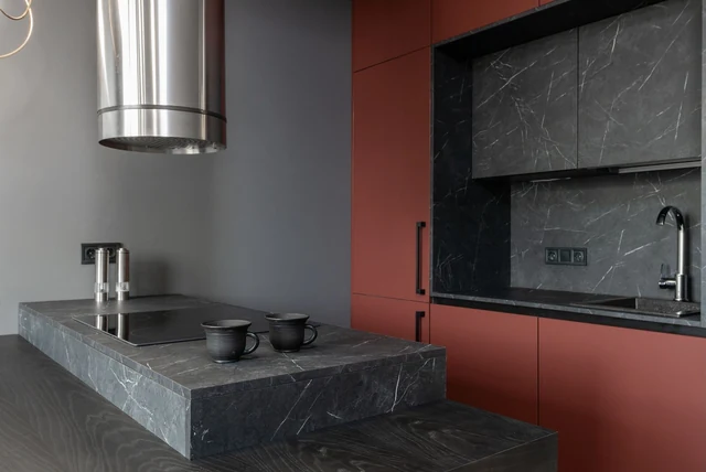

Everyone I know who has fitted a red kitchen has one of two faces when you ask about it. Either they light up, or they laugh nervously and mention repainting. The difference is almost never the colour itself — it is how much of it went in. Burgundy kitchen ideas UK homeowners actually live with happily tend to use deep red as a single strong gesture, not as the whole room. Get that ratio right and it is one of the most welcoming kitchens you can walk into.
| What burgundy is | A deep, muted red with brown or purple depth — not a bright pillar-box red |
|---|---|
| 2026 status | Deep reds and burgundy are stepping back into kitchen design |
| How to use it | Selectively: islands, cabinetry runs or bar areas rather than every wall |
| Best worktops | Dark stone, warm timber, or a pale cream for contrast |
| Best metals | Brushed brass, bronze and matt black; avoid bright chrome |
| Best rooms | Kitchens with decent daylight, or as an island in a paler room |
| Biggest mistake | Wall-to-wall gloss red, which is what dates a kitchen fastest |
Burgundy Is Not the Red You Are Worried About
Burgundy Is Not the Red You Are Worried About
Image source: pexels.com
The red kitchen has a bad reputation in Britain and it is largely deserved, but the guilty party is bright glossy red, not burgundy. Burgundy is a deep, muted red with brown or purple sitting underneath it — closer to a good claret than to a postbox. That depth is what makes it behave like a dark neutral rather than a shout. Where bright red pulls the eye and holds it, burgundy recedes in low light and glows under a lamp. If you have only ever seen the 1990s gloss red version, the difference in person is genuinely surprising. Order a sample door and look at it in the evening, not under showroom spotlights.
Deep Red Is Coming Back for 2026
Deep Red Is Coming Back for 2026
Image source: pexels.com
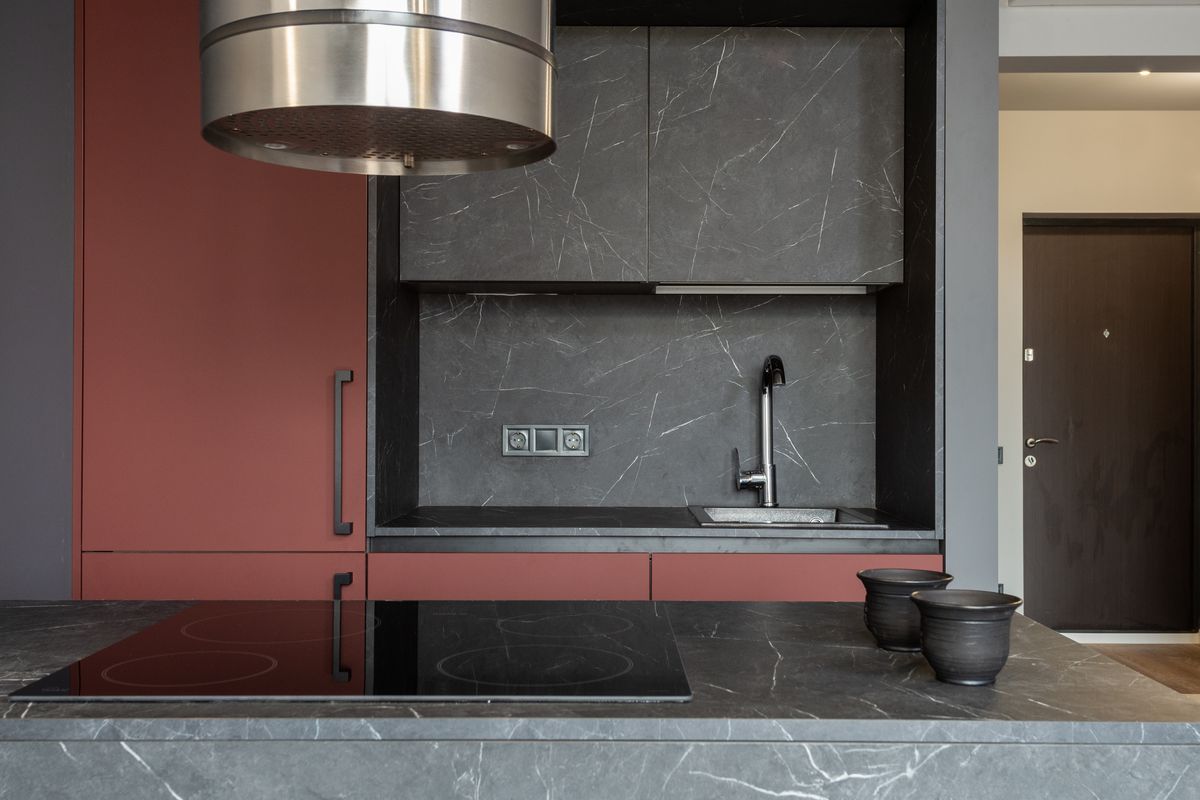
This is not a colour hanging on from a previous decade. Deep shades of red and burgundy are stepping boldly into kitchen design for 2026, and the guidance from designers is consistent: they work beautifully when used selectively, on islands, on a run of cabinetry, or on a bar area, rather than across every surface. That matches the wider direction of travel, which is towards warmer, richer, more grounded colour after a decade of cool grey. Burgundy is simply the boldest end of the same instinct that made taupe and clay popular. If you want the calm version of that instinct, taupe kitchen ideas sit at the other end of the scale.
The Island-Only Approach
The Island-Only Approach
Image source: pexels.com
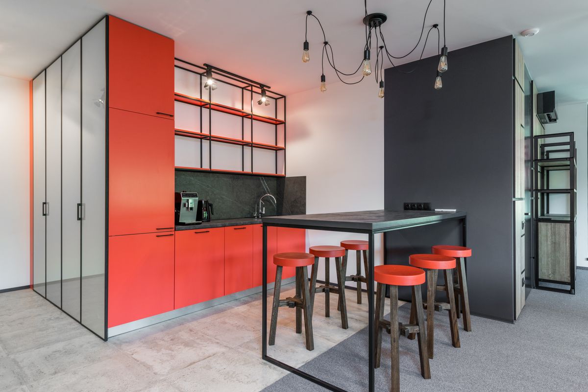
If you want burgundy and you are nervous, put it on the island and nothing else. This is by far the most successful way British kitchens use deep red, and it works for a practical reason as much as an aesthetic one: an island is a freestanding block, so a strong colour there reads as a deliberate feature rather than as a decision that got out of hand. Keep the perimeter units pale — cream, ivory, oat or a soft stone — and the burgundy becomes the thing people comment on rather than the thing they have to look past. It is also the cheapest version to change your mind about later.
Worktops That Suit Deep Red
Worktops That Suit Deep Red
Image source: pexels.com
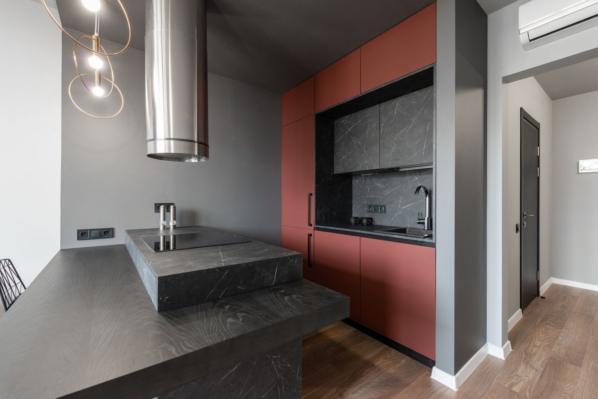
Burgundy needs something to sit against, and the choice pulls the room in very different directions. A dark stone worktop, particularly a charcoal or a deep veined granite, grounds burgundy and makes the whole scheme feel expensive and quite masculine. Warm timber softens it completely and is the right answer in a period or country kitchen. A pale cream or off-white worktop gives you maximum contrast and keeps a smaller room bright. What rarely works is a cool grey quartz, which fights the warmth in the red and leaves the kitchen looking slightly unresolved. The same principle applies to a black kitchen floor, which suits burgundy but only in a bright room.
Metals: Warm, Never Bright Chrome
Metals: Warm, Never Bright Chrome
Image source: pexels.com
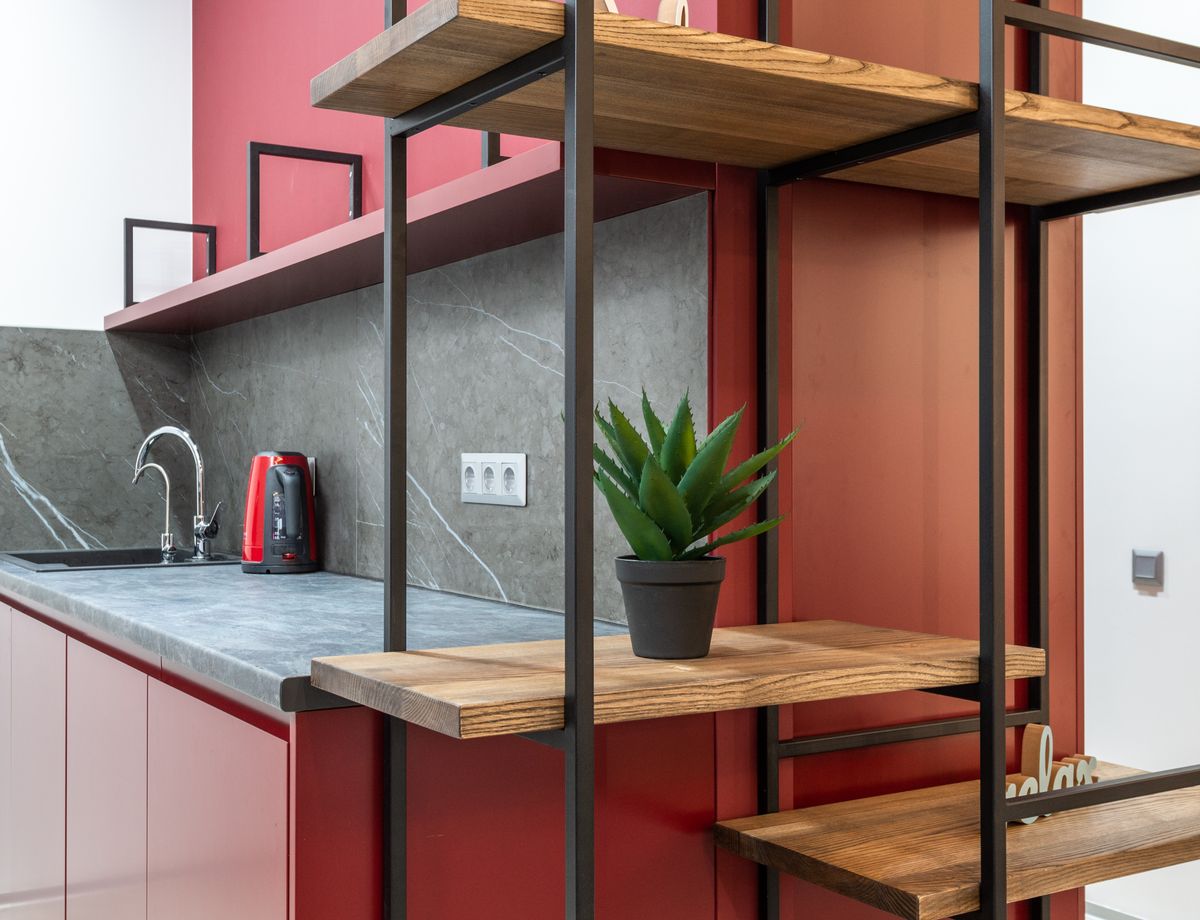
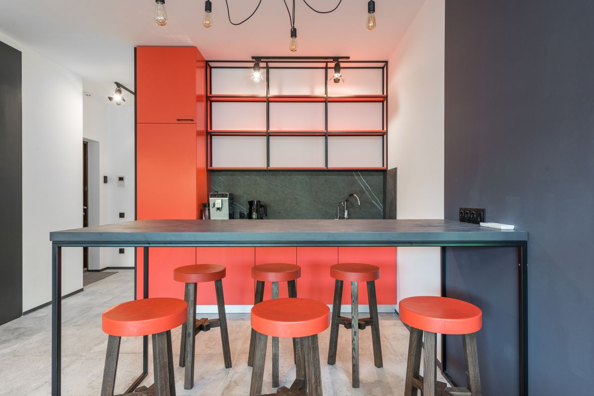
Burgundy is a warm colour with real depth, so it wants metal that agrees with it. Brushed and antique brass look genuinely rich against deep red and pick up the warmth underneath. Bronze does the same with more weight, which is why bronze kitchen taps suit burgundy so well. Matt black is the modern option and gives a sharper, more graphic result. Bright polished chrome is the one to avoid: it is cool and shiny against a deep matt colour, and it is the detail that makes a burgundy kitchen read as dated rather than considered. As always, pick one metal and use it throughout.
Where Burgundy Works in a UK Home
Where Burgundy Works in a UK Home
Image source: pexels.com
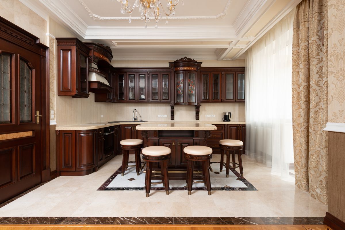
Deep colours want light, and burgundy is no exception, but it is more forgiving than a true dark because the red carries its own warmth. In a kitchen with reasonable daylight it will look rich all day. In a genuinely dark north-facing galley, wall-to-wall burgundy will feel heavy by November — that is the room where the island-only approach earns its keep. It suits period properties particularly well, sitting comfortably beside original timber, brick and warm stone. In a very modern white box it can look striking, provided the rest of the scheme is restrained enough to let it lead.
Small Kitchens: One Element, Not All Of Them
A small kitchen in full burgundy becomes a very intense room very quickly. The workable version is one element only: the base units with pale wall units above, a single run of tall cabinets, or just the door fronts on an island or peninsula. Keep the worktop and splashback light, choose slim or handleless doors so the colour reads as one clean block, and let the floor stay pale. Done that way, burgundy actually helps a small kitchen, because a single deep colour gives the room a focal point instead of the flat all-white look that makes compact kitchens feel like corridors. Clear surfaces matter more than usual, so plan the kitchen storage properly.
Matt, Satin or Gloss
This decision matters more with burgundy than with almost any other colour, because gloss is exactly what gave red kitchens their reputation. High-gloss burgundy reflects light hard, exaggerates the red, and looks unmistakably like a particular era of kitchen. Matt and satin finishes do the opposite: they absorb light, let the brown and purple depth show, and read as contemporary. A matt burgundy shaker door in a period house looks like a considered heritage choice; the same colour in high gloss looks like a showroom clearance. If you want any shine at all, take it in the hardware and the worktop rather than the doors.
Colours That Live Well With Burgundy
Burgundy is strong enough that it does not need much help, and the schemes that work best keep everything else quiet. Cream, ivory and warm off-whites are the safest partners and let the red do the work. Warm timber is the natural companion. Deep green is the more adventurous pairing and looks superb in a period kitchen, though it needs a large room to breathe. Brass or gold accents lift the whole scheme. What to avoid is another strong colour competing at the same volume, and anything cool and blue-toned, which fights the warmth. If you prefer the pale partner, ivory kitchen ideas pair particularly well with a burgundy base.
Walls, Splashbacks and the Rest of the Room
With burgundy cabinets, the walls should step back rather than join in. A warm off-white, a soft stone or a very pale clay all work; brilliant white can look harsh against deep red, and another strong colour turns the room into an argument. For the splashback, a simple warm tile or a continuation of the worktop keeps things calm, while a marble with warm veining adds interest without adding colour. On floors, warm timber or a biscuit-toned tile lifts the room. And leave some worktop clear — a strong colour needs visual space around it or the kitchen starts to feel crowded even when it is tidy.
Will You Still Like It in Ten Years?
The honest answer is that it depends entirely on how much you used. A burgundy island in a cream kitchen is a decision you can reverse in a weekend with a tin of paint, and plenty of people never want to. Wall-to-wall high-gloss burgundy is a decision you will be living with, and it is the version people end up replacing early. That is the whole argument for using deep red selectively: it gives you the character without the commitment. If you are unsure, do the island first, live with it for a year, and extend it later if you still love it. Very few people regret that order.
Final Thoughts
Burgundy is a far better kitchen colour than its reputation suggests, as long as you use it as a feature rather than a wall covering. Put it on the island or the base units, keep everything else pale and warm, choose brass or matt black over chrome, and pick matt rather than gloss. Do that and burgundy kitchen ideas give you a room with real character that still feels calm. Start with a sample door and look at it in the evening.
Frequently Asked Questions
What colour is a burgundy kitchen?
Burgundy is a deep, muted red with brown or purple depth, closer to claret than to bright pillar-box red, which is what gives it its richness.
Is burgundy a good colour for a kitchen?
Yes, used selectively. Deep reds work best on islands, a single run of cabinets or a bar area rather than across every surface.
What worktop goes with burgundy kitchen units?
Dark stone grounds it, warm timber softens it, and pale cream gives contrast. Avoid cool grey quartz, which fights the warmth.
What handles suit a burgundy kitchen?
Brushed or antique brass, bronze, or matt black. Bright polished chrome looks cool against deep red and dates the scheme.
Can burgundy work in a small kitchen?
Yes, on one element only — base units or an island — with pale worktops and wall units. Full burgundy makes a small room intense.
Should burgundy cabinets be matt or gloss?
Matt or satin. Gloss exaggerates the red and is what gave red kitchens their dated reputation; matt lets the depth show.
Disclaimer
This article is for general information only. Colour appearance varies with lighting, room aspect and finish, so always order sample doors and view them in your own kitchen before ordering. Product specifications and availability change over time.