
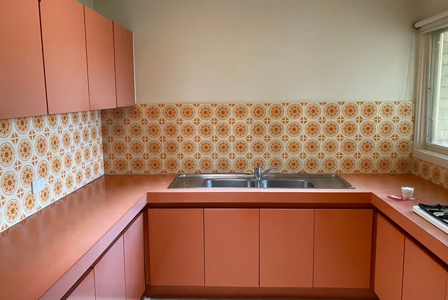

Terracotta is the colour of a plant pot left in the sun, and for years that was exactly the problem — it read as holiday villa rather than British kitchen. Then the whole industry started moving towards warm earth tones and suddenly it made sense here too. The terracotta kitchen ideas UK homeowners are asking about now are softer, dustier and far more grown-up than the orange pine kitchens of the nineties. Used properly, it is one of the warmest rooms you can build.
| What terracotta is | A warm earthy orange-red with a dusty, clay-like softness |
|---|---|
| 2026 status | Burnt ochre and earthy tones are part of the 2026 palette for depth |
| Best used | On base units, an island or a splashback rather than the whole room |
| Best partners | Cream, oat, warm white, deep green and natural timber |
| Best metals | Brass, bronze and aged gold; avoid bright chrome |
| Best rooms | Kitchens with warm daylight, or any room needing warming up |
| Biggest mistake | Pairing it with cool grey, which turns terracotta muddy |
Terracotta Is Not Orange Pine
Terracotta Is Not Orange Pine
Image source: pexels.com
This is worth clearing up first, because it is the association that puts people off. The orange kitchens people remember from the nineties were varnished pine, and their orange came from a shiny finish over yellow-toned wood. Terracotta is a paint colour, and a dusty one: a warm earthy red-orange with clay softness and no shine at all. In matt, on a flat or shaker door, it reads as grounded and considered rather than dated. The two look nothing alike side by side, which is why it is worth ordering a sample before you rule the colour out on memory alone. Look at it against your floor, not against a showroom wall.
Where Terracotta Fits in 2026
Where Terracotta Fits in 2026
Image source: pexels.com
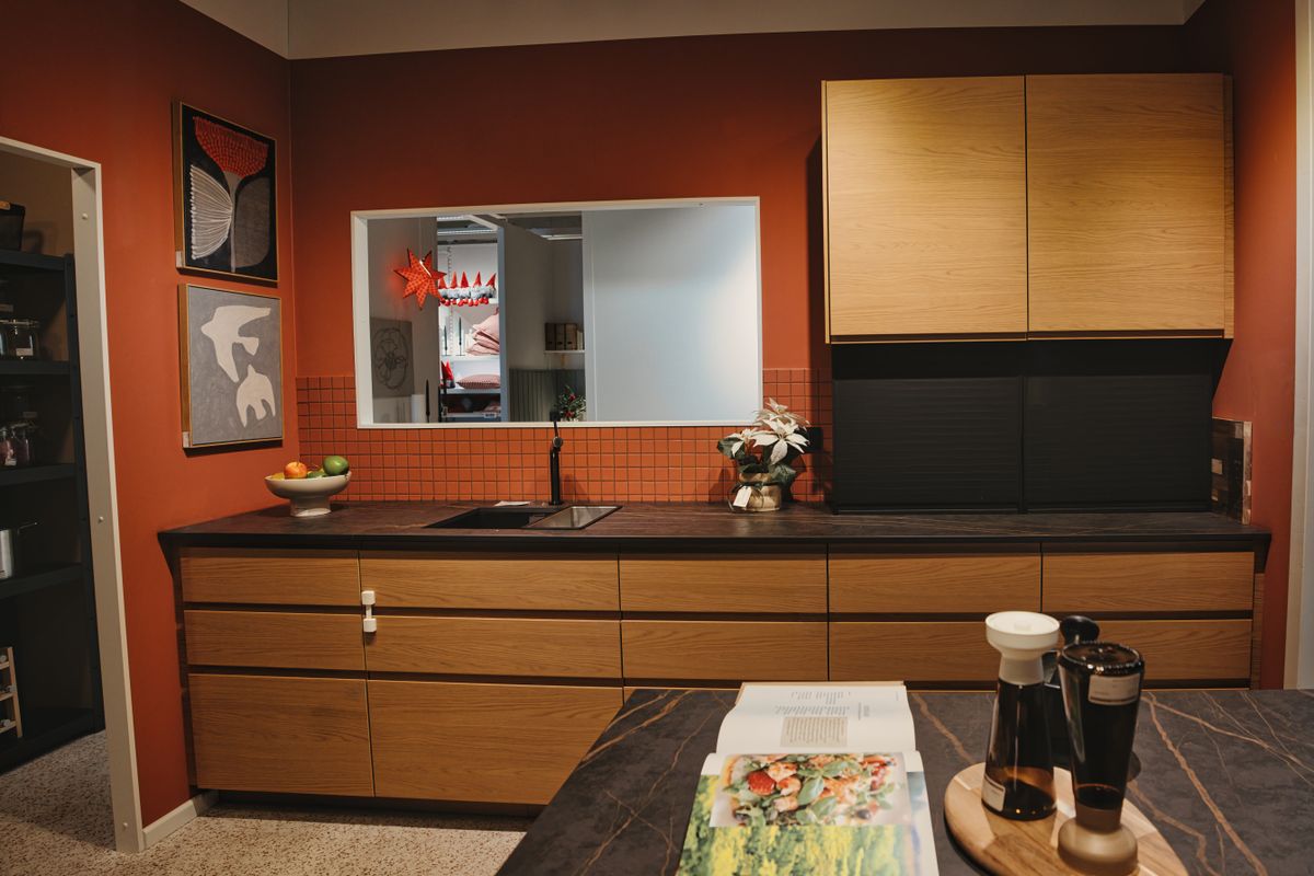
The wider direction of kitchen colour is towards warmth, and the 2026 palette specifically keeps earthy tones like burnt ochre for depth alongside the softer neutrals of taupe, mushroom, stone, oat and clay. Terracotta sits at the strongest end of that family. It is a colour with character rather than a safe neutral, which is exactly why it works best as part of a scheme rather than as the whole thing. If you want the same warmth with none of the risk, taupe kitchen ideas are the quiet version of the same instinct, and the two sit together beautifully.
How Much to Use
How Much to Use
Image source: pexels.com
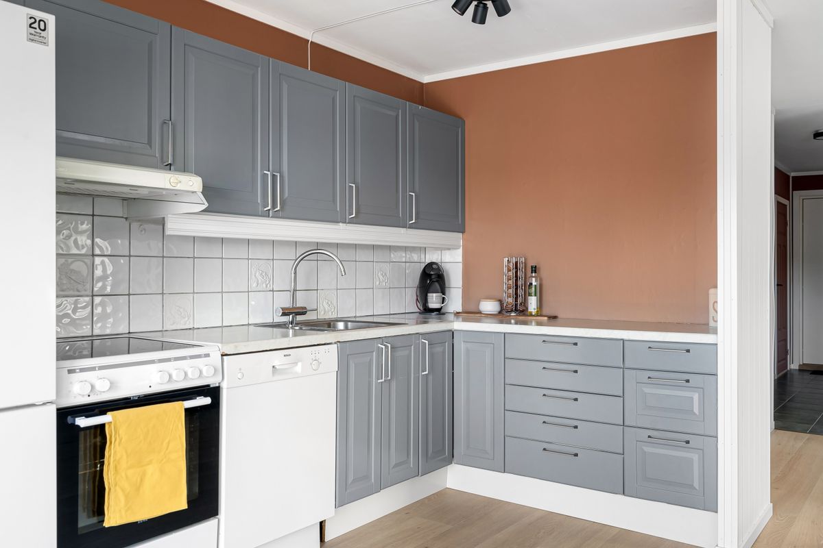
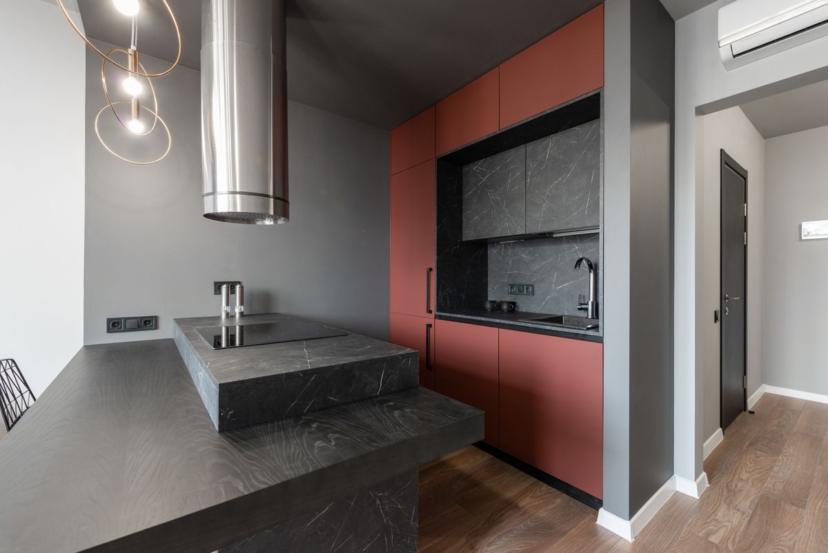
This is the whole decision. Terracotta on every unit in an average British kitchen is a lot of colour in a small space, and it is where people end up regretting it. The versions that work tend to use it once, strongly: on the base units with cream above, on an island in an otherwise pale kitchen, on a single run of tall cabinets, or as a splashback tile with neutral units around it. That gives you the warmth and the personality while leaving the room somewhere to breathe. It is also the cheapest thing to change your mind about, which matters with any colour this distinctive.
Pairings That Keep It Modern
Pairings That Keep It Modern
Image source: pexels.com
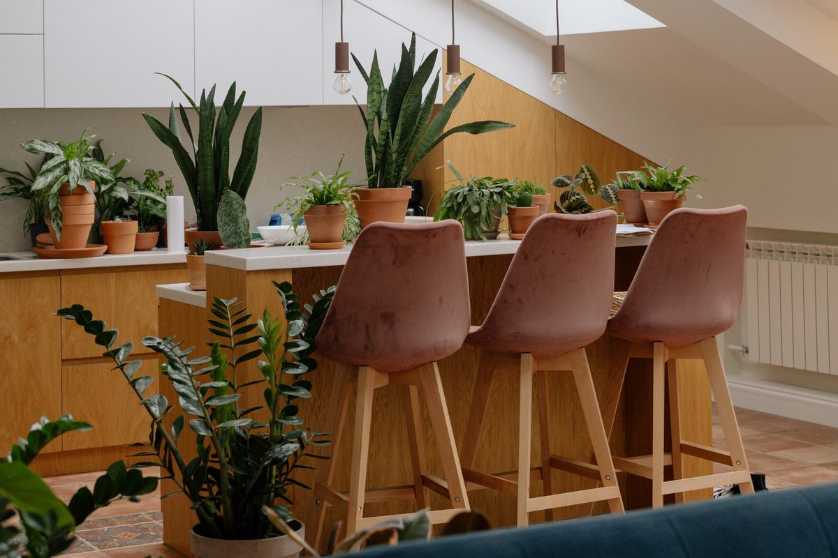
Terracotta is a warm colour, so it wants warm company. Cream, oat and warm off-white are the safest partners and let the terracotta lead. Natural timber is the natural companion, especially oak and a mid-toned walnut. The more interesting pairing is deep green, which sits opposite terracotta on the colour wheel and gives a rich, slightly Mediterranean result that works surprisingly well in a British period kitchen. What consistently fails is cool grey. A blue-grey worktop or a grey floor drags terracotta towards looking muddy and undoes the warmth entirely, which is the single most common mistake with this colour.
Worktops and Splashbacks
Worktops and Splashbacks
Image source: pexels.com
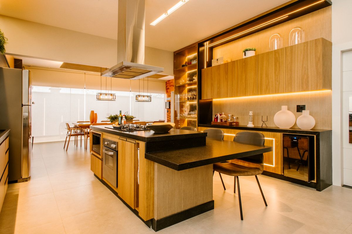
For worktops, timber is the most sympathetic choice and keeps everything in the same warm family. Cream or biscuit-toned stone gives contrast without coldness and keeps a smaller kitchen bright. A dark worktop, whether charcoal stone or a deep green, grounds terracotta and stops the room feeling too soft. For splashbacks, this is the colour that genuinely suits pattern — zellige, handmade-look tile and terrazzo all work, because the slight irregularity echoes the earthiness of the colour. A patterned splashback in warm tones is often the easiest way to introduce terracotta if you are not ready to commit to cabinet doors.
Metals and Hardware
Metals and Hardware
Image source: pexels.com
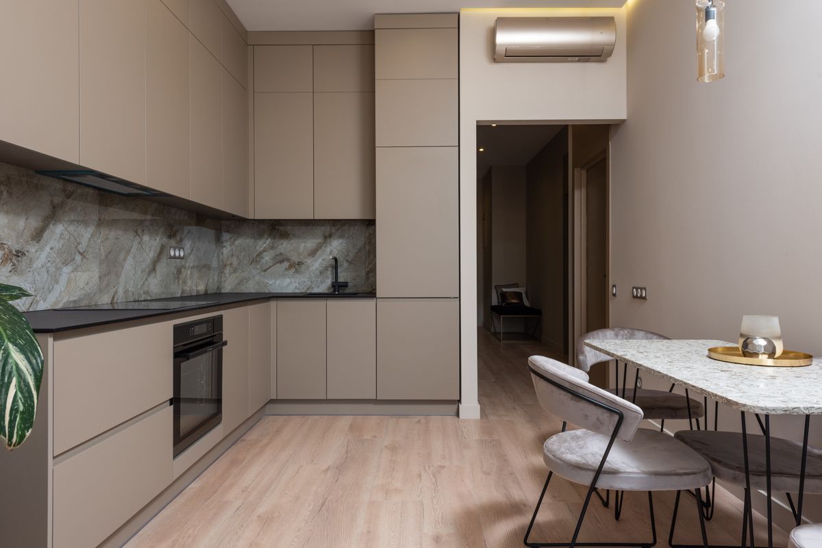
Warm metals are almost compulsory here. Brass and aged brass look superb against terracotta and share its undertone. Bronze goes further and reads more rustic, which suits a country kitchen; bronze kitchen taps are a natural fit. Aged gold and unlacquered brass that patinate over time suit the earthy, lived-in quality of the colour particularly well. Matt black works and gives a sharper, more contemporary edge. Bright polished chrome is the one to avoid — it is cool and hard against a soft warm colour, and it makes the whole scheme look like the pieces were chosen separately.
Terracotta in a Small Kitchen
A small kitchen can absolutely take terracotta, but it needs rationing. Use it on the base units only, with cream, ivory or warm white above and a pale worktop, and the room gains warmth without closing in. Or keep the units neutral entirely and put the terracotta into the splashback, which gives you the colour at eye level where you actually enjoy it while leaving the bulk of the room light. Handleless or slim handles help, and keeping the floor pale is important — a terracotta floor under terracotta units is far too much of one thing in a compact space.
Finish: Matt Every Time
If there is one non-negotiable with this colour, it is the finish. Gloss terracotta looks like plastic and pushes the colour towards the orange people are afraid of. Matt lets the dusty, clay-like quality come through, which is the entire appeal. A slightly textured or grained finish is better still, because the surface catches light unevenly and gives the colour depth. This is also why handmade-look tiles suit terracotta schemes so well — the irregularity does the same job. If you want shine anywhere, put it in the tap and the handles.
Which Rooms It Suits
Terracotta is one of the few strong colours that improves a north-facing kitchen, because it brings its own warmth to a room that has none. In a south or west-facing kitchen with strong afternoon light it can become quite intense, so it usually wants to be used more sparingly there. It suits period properties naturally, sitting comfortably with original brick, timber and stone flags. In a modern white box it works as a single bold gesture. Where it struggles is a room already committed to cool tones — grey flooring, chrome fittings, blue-grey walls — because everything pulls in opposite directions.
Walls, Floors and Finishing Touches
Give the walls a rest. A warm off-white, oat or soft plaster tone lets the cabinets lead, while another strong colour turns the room busy. On floors, warm timber is the classic answer, and a genuine terracotta tile floor is beautiful but should generally be paired with neutral units rather than terracotta ones. Bring in a little green through plants, which looks wonderful against earthy orange and costs nothing. And keep the styling simple: with a colour this warm, a clear worktop and a couple of wooden boards do more than a shelf full of accessories.
Is It a Risk?
It is a stronger choice than a neutral, and it would be dishonest to pretend otherwise. But the risk is manageable and it comes down to placement rather than the colour itself. Terracotta on an island or a splashback is a decision you can reverse cheaply. Terracotta across every door in a small kitchen is a decision you live with. Earthy tones are firmly part of the current direction rather than a passing trend, so the colour is unlikely to look dated soon — but as with any characterful shade, the safest approach is to use it where changing your mind costs a weekend rather than a kitchen.
Final Thoughts
Terracotta gives a British kitchen something most neutrals cannot: genuine warmth. Keep the finish matt, pair it with cream, timber or deep green, choose brass over chrome, and use it once rather than everywhere. Get that balance right and terracotta kitchen ideas stop sounding like a holiday villa and start looking like the most welcoming room in the house. Order a sample and hold it against your floor before you decide.
Frequently Asked Questions
What colour is terracotta in a kitchen?
A warm earthy orange-red with a dusty, clay-like softness. In a matt finish it reads as grounded rather than bright orange.
Is terracotta a good kitchen colour for the UK?
Yes, especially in north-facing kitchens that need warmth. It works best used on base units, an island or a splashback rather than everywhere.
What colours go with a terracotta kitchen?
Cream, oat and warm off-white are the safest. Natural timber suits it, and deep green is the richer pairing. Avoid cool grey.
What worktop suits terracotta kitchen units?
Timber keeps everything warm, cream stone adds brightness, and a dark worktop grounds it. Avoid blue-grey quartz, which makes terracotta look muddy.
Should terracotta cabinets be matt or gloss?
Matt every time. Gloss pushes terracotta towards bright orange and looks plastic; matt lets the dusty clay quality show.
Is terracotta still in style for 2026?
Yes. Earthy tones including burnt ochre are part of the 2026 palette, used for depth alongside warm neutrals like taupe, stone and clay.
Disclaimer
This article is for general information only. Colour appearance varies with lighting, room aspect and finish, so always order sample doors and view them in your own kitchen before ordering. Product specifications and availability change over time.